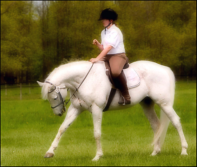
My first impression of this shot is that it is a dreamy, ethereal kinda of shot. It kinda seems like it should be a romance or something.
Compositionally, I really can nitpick anything about it, except to say that I almost wish there were more space at the left and top. I think that would make it have a bit more "motion" as the horse would have somewhere to "go," and I can't really express why I think it needs more at the top other than I just think it does. :/ sorry.
The colors on this really appeal to me. Her earthtone colors and the stark white of the horse really set up a nice contrast with the green in the background.
The SD looks a bit tentative, but that wouldn't necessarily add/subtract to the score of your shot other than affecting the overall effect of it. Being her first competition, a bit of tentativeness is to be expected. With a bit of confidence gained, make sure you reshoot this so she can see the difference that it makes when she is riding (and I'm sure the judges notice.) :)
That is an absolutely beautiful horse.
Why only 5.3ish? I'm not sure. Had I voted, I probably would have given it a 7 or so. The shot is technically well done, and has a nice effect to it. I know it sounds cheesy, but had the daughter been looking confidentally at the camera and showing her pride (and consequently mirroring the horse's pride)I think that would have added to the effectiveness of the shot. As it is, it feels like a "grab shot." Obviously, that is an entirely different picture, but I think you have the beginnings of it here.
It IS a good picture, and one that you and your SD can be very proud of. Best to you in future challenges?
I don't kow what to do with this image. I like it, then I see alll its faults, but then I still like it. First impression was the glow of the horse and white shirt. It looked cool. Then I saw that what it really was is the mash of the background to darken it - and it's not that well done. Then I look at the overall effect and it's really really good, particularly the colour of the background in contrast to horse and rider. Not sure that a movie owith that title would draw a big crowd but I like the entry
Focus seems a bit soft on the rider. I think a shot of the horse's head up would fit the movie title a little better. the horse seems to be a little too birght as well.
a family movie. the wife and kids will like it. the horse isn't being very expressive, though. he's in kind of an odd, stiff position. The rider isn't terribly expressive, either.
I could be wrong here but it looks like the background is manually blurred. The problem is that the near background is blurred to the same degree as the far background. And there's a bit of a halo around the upper part of the horse and rider which is distracting. Still, I like the way you caught one foot up and the color balance is nice.






 Add photograph to your favorites
 Add photographer to your favorites


 Photographer found comment helpful.


