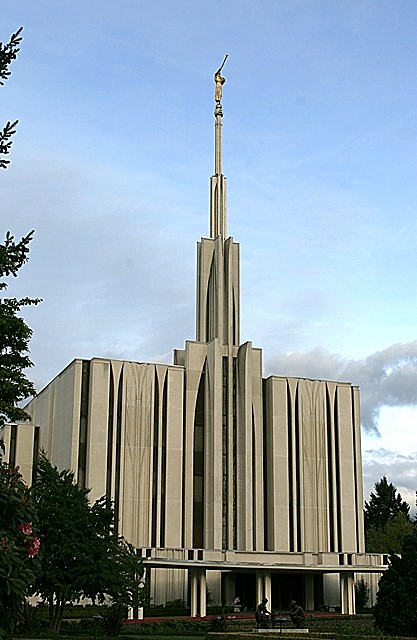
adjusted the exposure and color saturation a bit, usm and crop.
I wanted to get rid of some of the branches up the side, but, well, it's basic editing, and cropping tighter made it look off balance to me.
Statistics
Place: 195 out of 250 Avg (all users): 4.7808 Avg (commenters): 5.6250 Avg (participants): 4.5238 Avg (non-participants): 4.9034 Views since voting: 739 Views during voting: 340 Votes: 260 Comments: 13 Favorites: 1 (view)
Oi! from the CPT MkII.
Wow, can't think of anything to say...
I like the architecture of the building. It's "clean" and "modern" and all that. Composition's okay. Could be better, could be worse, but definitely on the good side.
Bump up the contrast, shift the sky's hue to a bluer hue, ease up on the sharpening, and I guess we'll have ourselves a postcard. Yeah, and a little recomposition, I guess.
First Impression: Nice shot of a too modern church for the people.
Composition: a bit too centered for me. I don't know the place, but maybe another perspective, not so in ront would have helped.
Subject: It meets the challenge, but maybe people was looking for more intimate images or not so modern churchs...
Technical: Colors OK, but it lacks a bit of more punch on the lighting. Maybe with the sun nearer to the dusk... The subject is on focus, but it seems a nit oversharpened. Maybe you used too much USM?
Improvement: change a bit the composition and try it at other time of the day
Summary: Not bad shot that DPCer's voters didnt like. Sorry for the score, but keep trying.
This photo reminds me of nothing so much as a 1960s era photo postcard. The colors seem just slightly off in exactly that direction. The temple is a bit bland, the sky a bit too light and turquoise. The image looks rather flat, so a bit of contrast might help punch things up. It looks like a better vantage point might have been slightly to the right to get the branches out of the way, which you already know is hindering the shot. But the real killer here I think is the oversharpening. Someone else pointed out the fringing around the branches, and they're absolutely right. That halo/fringe effect is the best thing for you to look for when trying to sharpen an image. If you see it, turn it down. If the sharpening was done in-camera, look for that setting in the menu functions and turn it down a notch, then do your sharpening manually in PP.
So there are several things I really like in your shot. The focal point here has some great architecture to it. Really wonderful choice. The statues in front also add to the environment as well. Finally the back drop colour of the sky is a really nice tone. All these things that make your shot unique are things that I would have like to see with a bit more emphasis.
If you were to reshoot this scene, may I suggest an angle that crops out the trees. Perhaps a chot from the front that has all the major components of the building but not all of it. I think the height of the building makes it difficult to shoot the entire thing & still retain the uniques to it.
Some technical stuff: on my monitor the shot looks a bit over sharpened and a tad on the dark side.
Ya gotta love Seattle when the sky is blue... and it makes this temple a little more graphic somehow. It's unusual to see no flowers in the foreground here, but I like the architectural rendering feeling. 8







 Add photograph to your favorites
 Add photographer to your favorites

 Photographer found comment helpful.


