First off, always try to include some info about the shot in the Photographer's Comments section. It really helps out when we know what the photographer was thinking and what equipment/lighting/etc. were used, especially when you request a critique.
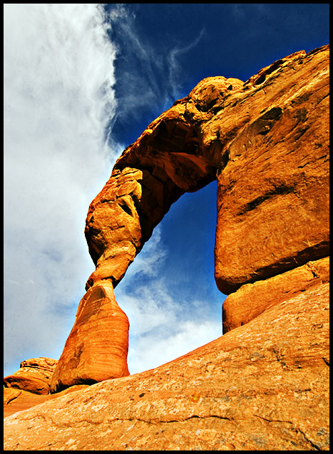
Camera Work/Technical: Wonderful exposure, crisp focus and great depth of field, ensuring that everything in the frame was in focus. The coloring a and WB seems spot on from the photos of this park I have seen in the past.
Lighting: Almost perfect. The only complaint that I have with the lighting is the shadow inside the top of the arch, but I don't think you would have achieved such a dramatic feel with the lighting any other way. The time of day you picked really makes the colors in this image come to life.
Composition/Content: I really like your chosen point of view here. You have a nice foreground that subtly leads the viewer into the frame, giving us the feeling of scaling up the arch. Then the arch itself takes over, leading us through the rest of the image. Very nice contrasting complementary colors between the arch and the sky. Great rule of thirds use, especially in the division of the sky.
My Opinion: It just doesn't fit into the DPC Cinema cahllenge like most voters expected. In complementary colors, this one would have been an easy top ten, I believe, as well in many other challenges. While I rarely even look at titles, this title just doesn't pull the entry into the challenge. I believe that this was one of the rare challenges wehre the title was actually significant. OVerall, I like the image. If scoreing, this one would have been in the 8+ range for me despite the title. You ahve a very powerful image that lacks very little from a technical viewpoint. Well-done.
I'm not getting a sense of "paradise," just desert. I suppose this could be a nature documentary, but the poster is not conveying the sense of "paradise"
Lovely colours! Could do with being fractionally sharper (though not at the edges - detail seems to be soft in the colour gradation in the solid parts of the rock)
Very cool shot - nice angle and lighting, and interesting clouds. My first impression was that this is a little too sharp, though, around the top of the arch. Now I'm not sure if it's that, or if the contrast is too much, but something seems to be just a bit off there. Otherwise, well done!






 Add photograph to your favorites
 Add photographer to your favorites

 Photographer found comment helpful.


