| Author | Thread |
Comments Made During the Challenge  |
|
|
05/16/2006 07:07:47 PM |
|
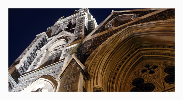
very interesting, it keeps the eye wandering. |
|
|
|
05/16/2006 11:05:45 AM |
|
|
|
05/15/2006 08:06:33 PM |
|
The large border is distracting... Sorry. |
|
|
|
05/14/2006 09:42:36 AM |
|
lighting are superb ! I would have liked to see this photo bigger... |
|
|
|
05/13/2006 03:51:14 PM |
|
Less border, but good shot |
|
|
|
05/12/2006 11:36:07 PM |
|
I like the lighting and the sense of size. I think the framing sets this apart from other shots of tall buildings that try to take in the whole building. |
|
|
|
05/12/2006 10:44:23 AM |
|
|
|
05/12/2006 07:32:09 AM |
|
Quite a striking picture of church architecture, albeit a bit chaotic, but doesn't say much about holiness IMHO |
|
|
|
05/11/2006 05:08:18 PM |
|
|
|
05/11/2006 04:21:39 PM |
|
Nice shot but the border is too thick and thus distracting. |
|
|
|
05/11/2006 09:31:34 AM |
|
Interetsing composition, sort of works, although it looks like everything is squeezed tightly into your frame. I rarely comment on frames, but I am not fond of this one. I do like the lighting in this. |
|
|
|
05/11/2006 08:27:30 AM |
|
Don't really like this thick/wide border, think it would have been better with a thinner one. I like the picture though. |
|
 Photographer found comment helpful. Photographer found comment helpful. |
|
|
05/10/2006 11:50:44 PM |
|
|
|
05/10/2006 11:15:41 PM |
|
too bad this picture isn't larger. You could have included more of the top of the building on the left. |
|
|
|
05/10/2006 08:20:35 PM |
|
Nice perspective, colors and crop. I like it |
|
|
|
05/10/2006 02:54:03 PM |
|
OK, I like this one. The border is huge, but I actually don't mind it. The perspective and lighting is well done. I reserve 8-10 scores for very good pictures and I think this qualifies (barely) 8. |
|
|
|
05/10/2006 12:04:08 PM |
|
Nice rich tones and an interesting perspective/angle. I like the way you've put this together. |
|
|
|
05/10/2006 08:19:25 AM |
|
The border spoils this good strong image..... |
|
| Photographer found comment helpful. |
|
|
05/10/2006 12:31:28 AM |
|
My eyes want to see more of the top of the left part of the church...the border may have been just a tad too large. |
|
| Photographer found comment helpful. |
Home -
Challenges -
Community -
League -
Photos -
Cameras -
Lenses -
Learn -
Help -
Terms of Use -
Privacy -
Top ^
DPChallenge, and website content and design, Copyright © 2001-2026 Challenging Technologies, LLC.
All digital photo copyrights belong to the photographers and may not be used without permission.
Current Server Time: 06/28/2026 04:23:18 PM EDT.