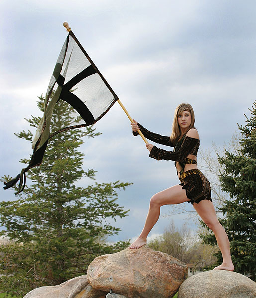
First let me begin with the fact that photojournalism is not my expertise. With my limited knowledge, this shot seems a bit too "set up" with what I think pj is.
I believe if the colors had stood out more the shot would have been a bit more interesting. They seem flat and the dull green just isnt nice. Same with the sky. More color would have helped. The position of the flag against the back drop of the tree draws away from the flag. That it is see through makes it blend in with the tree even more.
The detail is sharp and the model is attractive, but I dont think it was enough to carry the picture. I am just not sure what the story is or what it relates to, even with the title. I wouldnt expect to see this shot in a newspaper.
You have a strong number of pictures in your challenge portfolio that are quite impressive. This may just be a hiccup on the path. I look forward to seeing what else you come up with in the future.
This is kind of a stretch for the challenge. A different title might have helped a little. If you know how, I would clone out the house in the background, it takes away from the almost mountainous feel from the rocks.





 Add photograph to your favorites
 Add photographer to your favorites

 Photographer found comment helpful.


