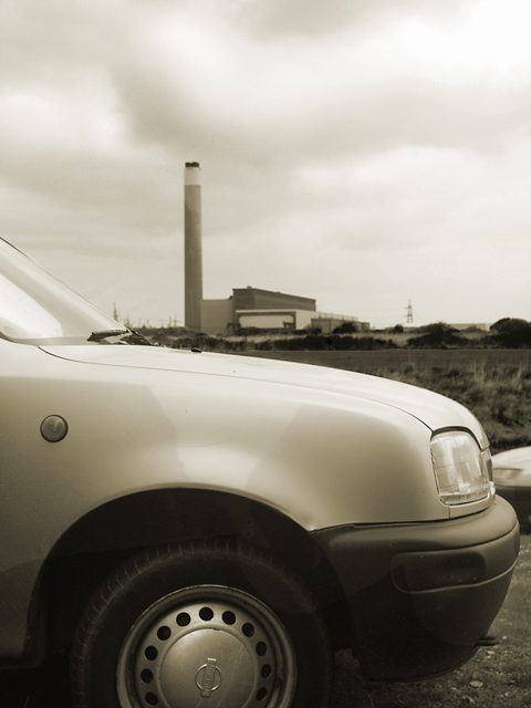
I like the toning of the shot. There is a shape on the fender of the car that distracts me; I'm not sure if it's lighting or what. The biggest problem, thematically, is that I don't see any pollution, so it feels kind of static. The "climate change" part of your title isn't shown in the picture, so I'm not sure if that should be there or not.
its like all the same non color. its just white. lol.
i think what may have been a better idea is to shoot smoke coming from both the car and the smokestack in the background. used a different colored car. that added with the "smokey sky" would have been pretty cool i think. though my images suck pretty badly.
Too bad this did poorly, because I completely "get" this in the context of the challenge. I personally think the cloudy (almost smoky) sky complements the smokestack idea, and together with the car, completes the concept.
Overall it may suffer from some technical problems. Composition isn't perfect, and I question the choice of portrait over landscape (without knowing what else may have gotten in shot). The tire is cut off, and there's another car at right that detracts somewhat. More burning would have helped. It's a better shot than 4.994 in my opinion though.
Trading Post comment
This is a shot that does depend on the title, but would work well with a similarly titled story. The second car just on the right of the picture kind of bothers me for some reason. I think the picture may have been a bit better balanced if the factory/smokestack had been framed such that it was closer to the right side of the picture, toward the front of the car, rather than being centered. The overall tone you selected for the image works well in portraying the concept of pollution.
well all of us have entered a bad picture in a challenge, this time it was your turn unfortunately...
since this is trading post I have to comment, and there are some things that could make this look better, the skies and car could use a heavy dodge & burn and increse in contrast, something to make the image pop.
the tone you chose for the image isn't helping, either way more sepia or completely B/W.
but no matter what you do, this image would never score higher then the bottom 20%
Trading post -
This shot didnt work so well for me. Looking at it closer now there seems to be an shadow(?) on the front of the car and tire. Not sure hwat would cause that. Cropping to have the whole wheel in the shot may have helped the shot not feel so cramped in the front. The background of the image doesnt hold much ineterest for me personally. A clear sky with some steam/smoke coming out of the stack would have been nice. Something a bit more. The lighting and contrast also seem a bit bright overall. Without the title I probably would not have had any idea what the pic was trying to say. Hope this isn't too harsh. Just my lwoly opinion for whatever it is worth.
Trading post...
I really liked this. I'm surprised it didn't do better. It seems a good 'commentary piece' photo. The light and shadow played well together and the factory in the background was a brillant touch. Be proud of this regardless of the score.
--Trading Post Comment--
I think this one suffered from a bit of overexposure, but you chose a really tough range of lighting to include. It is really tough to get all the necessary detail when you have a dark area like the tire and a really bright area like the diffused sky. A GND filter would help out a great deal, but it would be tough even with a strong one. Pretty good composition, but I'd rather see the full tire in the frame. There is also a distracting reflection around the tire and bumper. Cool scene, but better execution was possible.
I like the idea of this photo, but I am not sure it works for me. If it had not been for the title I would have missed the message. I like the monochromatic approach. I wish smoke from the stack was evident. It seems like it is a cloudy day, but I can't see any smoke on my monitor. Looks like a car is approaching from the right. It's a bit distracting. (This may sound a bit negative...that's not my intention.)
good photo, i would experiment with this photo in the way that i would crop out the wheel totaly so the lower part of the photo would be unregonizable in the first moment so the viewer get pulled into the thinking ... :-)
The title would work better with a photo of a traffic jam or busy highway. What I see here is just a static picture of the front genders of a car. Not really newsworthy to me.





 Add photograph to your favorites
 Add photographer to your favorites

 Photographer found comment helpful.


