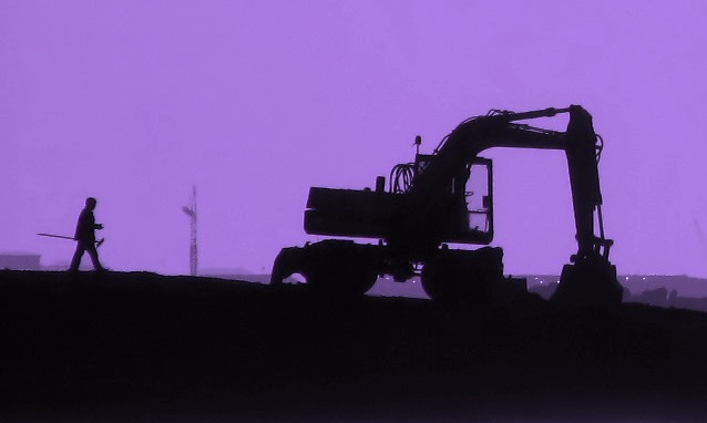
Actually taken in Reykjavik towards the sun in the afternoon. Hope the change makes it look like it is taken in the morning when people go to work.
1.Cropped
2.Saturation to get all colours out. (B/W)
3.Hue to get the desired colour background.
Was kinda brownish colour. (Hope I don't get the brown one)
4.NeatImage
5. Brightness and contrast almost unchanged.
My wildest score guess is from 4.3 to 6.3, of course hoping for the better.
----------------------
Yes you are all right.
I only had windows picture manager to save for web and therefore the "fuzzyness" around man and machine and also clumps in the sky.
After saving the program does not show the alteration. Too see it you have to open the picture again so I didn't notice until afterwords.
I don't have PS but now I have downloaded a free version of GIMP and I am trying it out.
Statistics
Place: 81 out of 183 Avg (all users): 5.7234 Avg (commenters): 6.9091 Avg (participants): 5.6500 Avg (non-participants): 5.7778 Views since voting: 1106 Views during voting: 251 Votes: 188 Comments: 20 Favorites: 1 (view)
The purple background is very interseting and it goes well with the black.
I think the picture would be more eye catching if it were at less af a slope.
The image would be better if it were sharper (but like you said that wan't your fault)
Good job!:)
Greetings from your own critique club. As always, the comments are based on my personal opinion about the picture.
First Impression: Very Nice Silhouette shot.
Composition: Good composition. The picture is tilted. I don't know if that was on purpose. I would have rotated the photo.
Subject: I really like the subject, Silhouette effect. But I don't know if it fits the challenge.
Technical (Colour and light): The lighting is good. The sky color is different, don't know if it's processed. I would have liked orange/yellow evening color beter in the BG.
Improvement: Rotate the picture, different BG color.
Summary: Nice picture over all. Rotate the picture, and see if you can do the different color balance.
Edit to add:
The horizon is fine, it's not tilted. Looking at the first site it looked like that, but it's not. My bad.
From the CTP MkII
Disclaimer: The following crits are personal opinions, not photographic dogmas. Please see them as suggestions, not claims of mastery nor a show of hauteur.;p
First Impression: Whoa, 6. It's pretty powerful. With proper pp, it could very well be on the front page of a daily, IMO.
Composition: 6 or 7. Composition's fine with me, even with the tilted horizon (or whatever that is:p).
Subject: 8. Because social realism rocks.
Technical: 5. This is where you screwed up, pare. I don't know if it's too much NI or the JPEG compression but the fuzziness really bugs me. Which was too bad because I liked the almost duotone look of your photo.
Improvement: I guess a little sharpening or a bit more contrast would do the photo a lot more justice.
Summary: I, for one, liked your photo. The less than stellar output is no fault of your photographic abilities, but of your pp skillz. Also, I'm a number too short on screws in the head so please do not be offended.;p
First Impression: Strong subject. Contrast between the silhouettes and the sky add to the strong theme.
Composition: The composition is good. It's a little minimalistic but that works well with the early morning aspect.
Subject: Strong subject however it's difficult placing the subject without first reading the title. Although I have no suggestions on how you could improve that unless there was a landmark nearby that could have been captured in the shot.
Technical (Colour and light): The lighting and color is good. One issue I do have is there seems to be some "fuzziness" going on around the silhouettes. That may just be jpg compression. If so I would suggest using less compression. Looking at the properties this photo weighs in at just 24k and you are alloted 150k for challenge entries so be sure to utilized as much of that 150k as possible to avoid artifacts.
Improvement: As I mentioned above, maybe find something that can tie the image more to the title without just relying on the title itself to describe the shot. This one is definitely difficult to do that since there are no faces to identify or unique structures but whenever possible try and do that. Also, utilize the file size you're afforded for the challenges. It does make a difference. Lastly, for an image to do well in DPC it needs a lot of wow factor. Even if this was a photo conveying peace in the Middle East I doubt this would help your score at DPC. At least not as well as a great sunset. So if you shot something like this again and wanted to do better with your score try and get something in that had some interesting cloud cover. That more than anything is what probably held you back in voting.
Summary: Great take to the challenge. The subject was definitely news worthy.
Hope this was of some help. If you have any questions feel free to PM or email me. I look forward to seeing more of your work!
My first impression when I saw this was that it didn't look much like the West Bank to me, and I couldn't tell what they were returning to work to do. I didn't like that I couldn't see the worker's face, which seemed to me like a rather important thing for a story like this. Putting a human face on the story is absolutely key.
For being such a low-demand image so far as color and detail go, I was surprised to see quality degradation around the man and the more intricate details of the machinery. It doesn't seem like it should be necessary to save it at just a low resolution.
I do like the color, though - the suggestion of early morning is good in a piece like this since it implies a certain honesty and wholesomeness - again that's part of making sure you get humanity in to the photo.
First Impression
A very striking image, clean and simple, yet powerful for all that.
Composition:
very good. the crane in the background is very effective, with the atmospheric perspective. the small lights in the distance help to create a feeling of isolation and loneliness. the way the horizon line extends in the background hill works very well.
Technical:
i'm not sure about the purple. i think i'd have liked a slightly more realistic sky colour. also, there seem to be some jpeg artifacts happening around the edges of objects, that i'm sure can be corrected (but i don't know how - change how you save???)
My opinion:
a very strong image indeed. i gave it a 7 in voting. well done.
This is a very cool looking shot. I love the silohuette idea. Very striking. It looks 'early morning' to me. The lights in the background give it some depth. The compostion works really well with the worker walking towards the 'machine' (I never can tell the difference between cranes, excavators, backhoes etc Ü). I don't have any ideas on what to improve here - love the shot the way it is.
Very nice shot and good score, Gunnar.
Composition is very dynamic, with your elements well distributed in the image, but to me there too much black in the image, maybe you could capture a bit of detail in your subject.
About the colors, good use of silhouettes in black and color of BG.
To improve: It seems you had some problems in the jpeg conversion because there are some visible artifacts, not very sure why.
Overall, a nice image that needs, IMO, more details in the subject.
This image seems a bit more compressed than it needs to be, and has visible JPEG artifacts as a result. Check out the section on resizing and saving for web in this tutorial, it may help: //www.dpchallenge.com/tutorial.php?TUTORIAL_ID=26
interesting color, from postprocessing ? oh, yes ... the quality of the iamge/photo could be better since is only 23.78 KB (24352 bytes) large ... you could make it better using the whole 150KB
Very interesting image. Nice silhoutte and great composition. There seem to be a lot of compression artifacts and the purple is a little too much so to suite my taste. Still like it, though.





 Add photograph to your favorites
 Add photographer to your favorites

 Photographer found comment helpful.


