| Author | Thread |
Comments Made During the Challenge  |
|
|
05/02/2006 02:06:21 PM |
|
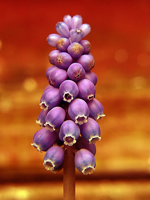
Excellent shot and nice background. Muscari don't look as good after a while - but you caught this one at its best. |
|
|
|
04/30/2006 09:09:41 PM |
|
Purple and orange aren't complimentary colors. But it's a nice shot, none-the-less. |
|
|
|
04/30/2006 11:27:16 AM |
|
background is distracting a simple yellow bangroudn would have been bette.r the title doesnt add to the photo 5. |
|
|
|
04/30/2006 09:21:32 AM |
|
Good color but I'd have preferred a tighter crop. |
|
|
|
04/30/2006 01:39:20 AM |
|
|
|
04/29/2006 08:18:06 PM |
|
That's striking! ... Try messing with the crop for a more dramatic effect. The colors are great and the focus and subject are right on. 7 |
|
|
|
04/29/2006 03:47:57 PM |
|
|
|
04/29/2006 02:34:30 PM |
|
i would offset the composition so that its not quite as symmetrically located (subject wise) |
|
|
|
04/29/2006 12:31:26 PM |
|
neat capture ... maybe a bit too much noise |
|
|
|
04/29/2006 09:13:06 AM |
|
|
|
04/28/2006 02:26:53 PM |
|
Nice colors. You should improve the DOF I think. |
|
|
|
04/28/2006 02:18:34 AM |
|
There is a bit of a color cast in this photo, which is usually the case when a lot of red abounds the frame. Scott Kelby has a section in his book, "The Photoshop Book for Digitral Photographers", that addresses this very issue using "threshold" and curves; setting the black, white and grey points. I would have liked the photo more without the color cast, and with a touch more contrast to bring out the color of purple; the red is too dominating. 3 |
|
|
|
04/27/2006 09:14:11 PM |
|
7 - Up from 6. Like this, but guessing it's tweaked in pp, which for the Challenge, is 'fine' in my opinion... just like to have seen the natural color of the little hyacinth - apologies in advance if you've not adjusted the color. A variation in composition may have also given this a little extra, not sure, as does work well as is. Nice macro, but 'if only' a little more detail in the flowers, but difficult. |
|
|
|
04/26/2006 11:25:27 PM |
|
|
|
04/26/2006 07:15:17 AM |
|
Purple / Orange ? Would liked to have seen more clarity on all of the bloom. Good shot, though. 7 |
|
|
|
04/26/2006 06:49:11 AM |
|
wow, that's sharp...colours are good, not sure I like the composition with the stem smack bang in the centre |
|
 Photographer found comment helpful. Photographer found comment helpful. |
Home -
Challenges -
Community -
League -
Photos -
Cameras -
Lenses -
Learn -
Help -
Terms of Use -
Privacy -
Top ^
DPChallenge, and website content and design, Copyright © 2001-2026 Challenging Technologies, LLC.
All digital photo copyrights belong to the photographers and may not be used without permission.
Current Server Time: 06/29/2026 08:27:22 PM EDT.