| Author | Thread |
Comments Made During the Challenge  |
|
|
05/01/2006 10:51:21 PM |
|
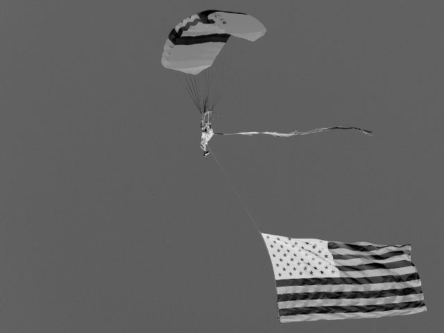
It's a little washed out and lacking contrast in positive, which makes it a bit dull in negative. |
|
|
|
04/30/2006 11:57:00 PM |
|
|
|
04/30/2006 08:30:24 PM |
|
Great choice-- the flag looks very cool reversed-- 9 |
|
|
|
04/30/2006 03:50:07 PM |
|
This might have more impact if you had inverted a colour image, not a B&W one. |
|
|
|
04/30/2006 10:36:24 AM |
|
Nice but the sky is a bit bland, think this would have been cooler in colour than in b/w. |
|
|
|
04/30/2006 06:19:31 AM |
|
|
|
04/27/2006 08:37:04 PM |
|
A different composition/crop might give more impact. |
|
|
|
04/27/2006 08:13:14 AM |
|
|
|
04/26/2006 05:07:59 PM |
|
cool photo yes, but inverting it barely changes the picture. i think inverting such a well known symbol like a flag takes away from the picture because it's immediately obvious that the photo has been inverted. |
|
|
|
04/26/2006 11:06:20 AM |
|
HUmmmm, Army Parachute Team. I watched them at Ft Sam this week, great capture, we must have been standing right next to each other. |
|
|
|
04/26/2006 08:02:09 AM |
|
I'd like to see the colour version of this. As it is I find it a little drab. Also the compositon could do with being a little more interesting. |
|
Home -
Challenges -
Community -
League -
Photos -
Cameras -
Lenses -
Learn -
Help -
Terms of Use -
Privacy -
Top ^
DPChallenge, and website content and design, Copyright © 2001-2026 Challenging Technologies, LLC.
All digital photo copyrights belong to the photographers and may not be used without permission.
Current Server Time: 06/30/2026 06:49:37 AM EDT.