Author Thread
Post actions
i really like this shot, i just think it needs a little bit of rotate.
Comments Made During the Challenge
Post actions
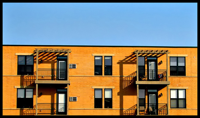
I find this photo fascinating. Make a nice book illustration with room for text in the sky.
Post actions
I like your choice of subject matter. Fits the challenge perfectly and is a bit different from the direction most photographers took. Love the strong shadows and the graphic feel of this. Good one.
Post actions
Clean simple lines with good color, I like it.
Post actions
Would be a nice shot if you weren't so sloppy with horisontals. Turn it 0,6 degree anticlockwise.
Post actions
love the picture, but the top of the building seems like its a little crooked, which takes away from the perfection of this shot. 7.
Post actions
Post actions
I love this style of photo, well done- 9
Post actions
Clever composition and good use of colour. Is the horizontal slightly off?
Post actions
Post actions
fits the challegne perhaps you could have boosted the blue sat.
Post actions
Post actions
I like the simplicity of this and the colors are great.
Post actions
clean lines and crisp. works for me.
Post actions
Nice image. I love the very geometric layout. Good tones. The harsh lighting compiments the geometric shapes very nicely.
Post actions
Post actions
wow... the graphic quality of this is impressive ( I wish I had done it :) )
Post actions
good shot, but i seems a little tilted
Post actions
Slightly off-level, and the sky could use a deeper blue, but I love this shot anyway. 8.
Post actions
Very nice. A slight rotation to the left would have made the horizon line perfect ;)
Post actions
I love it. Simple things work well. I would darken it a bit, but this way works well also. Congrats.
Post actions
Bet you are getting a little beaten up because the horizon is askew. I like it when photogs actually go out and find something complimentary instead of doing a studio shot...extra points for that.
Post actions
Eye catching contrast. I like the sharp focus and edges.
Post actions
Post actions
I love the simplicity of this shot. The small details that make each residence different, really draw me in. Great job presenting even tone and color. Went back and gave it an 8.
Post actions
i really love the strong lines and shadows.
Post actions
Nice, maybe just a bit of a tilt to the right.
Post actions
I like the lines, great shot
Post actions
good simple shot...well done
Post actions
5 - Simple and the colors work in my opinion. The other 'factors' don't detract enough to take attention away from the color scheme. This more symmetrical would be better in my opinion.
Post actions







 Add photograph to your favorites
 Add photographer to your favorites

 Photographer found comment helpful.


