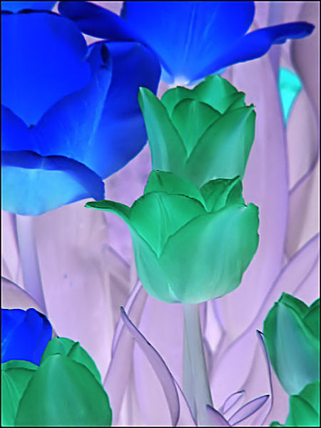
I have to admit, this negative challenge has been very difficult to score, and even more difficult to critique. Your shot is no exception. While on one hand, you have an awesome display of negative colors, I think that it works against you just as much as it works for you. The contrasting colors in negative form don't really allow the viewer's eye to choose any one subject. Everything here just busily fades together. The blues in the upper left hand corner are the brightest elements in the shot, thus working to tug the eye to the corner. Without that area of brightness, you have a nice composition. There is also nothing really to draws the eyes around and into the frame. You did a pretty nice job with a very difficult challenge. I think that the 4.5-5.0 range is appropriate for this photograph to score.
The negative efect makes this very interesting. I would like the crop to either be tighter to help focus on the green tulips OR cropped a little looser to help the blue flower become more of the composition.






 Add photograph to your favorites
 Add photographer to your favorites

 Photographer found comment helpful.


