| Author | Thread |
|
|
05/05/2006 08:22:35 AM |
|
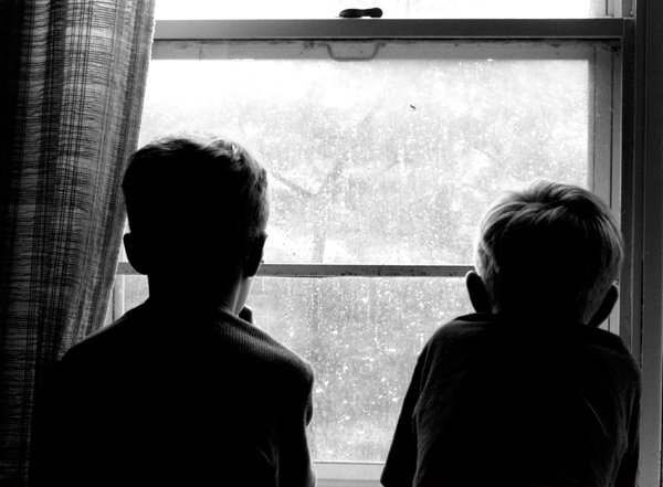
Well, each to their own. I personally think that the horizontal line in the composition looks accidental rather than planned. |
|
|
|
05/01/2006 10:51:08 PM |
Originally posted by BobsterLobster:
Silhouettes not clear enough. The horizontal line near the centre cuts through boys' heads and makes photo less effective. |
Arggggh! Two of the things I most liked about it! The less-than-silhouette treatment established a connection, a small but significant bridge, between the boys and their longed-for outside world; an effect wholly sympathetic to the point of the photograph. Likewise, the horizontal bar serves a useful figurative purpose, too: it is a barrier between the two worlds, reinforcing the fact that they are prevented from going outside. The bar also physically connects the two boys, although this is hardly necessary in appreciating their shared yearning.
I suppose if your ambition is limited to making a graphically impressive (and technically 'correct') image, these things might be viewed as flaws; but if you are interested in producing a more durable and more thoughtful photograph, they are worthy inclusions. |
|
 Photographer found comment helpful. Photographer found comment helpful. |
Comments Made During the Challenge  |
|
|
04/30/2006 07:43:36 PM |
|
Silhouettes not clear enough. The horizontal line near the centre cuts through boys' heads and makes photo less effective. |
|
|
|
04/30/2006 11:44:10 AM |
|
I know that feeling. Saw a similar shot as this but shot from the outside and I like that better, this needs some facial expressions as I don´t really connect to this as it is. |
|
|
|
04/30/2006 12:05:27 AM |
|
Nice composition... they do look bored... well done |
|
|
|
04/29/2006 04:02:38 PM |
|
I like this. Has a 60's / Mayberry feel to me. Nice use of b/w. |
|
|
|
04/29/2006 12:55:31 PM |
|
looks like a pretty old photo... it would have been better if the kids would have been closer to each other.. |
|
|
|
04/28/2006 06:43:26 PM |
|
This is a classically good photograph, filled with both charm and challenge for the viewer. Just asymmetrical enough to retain some tension, just enough detail to suggest some emotion, but still contains sufficient figurative blank spaces to demand some effort and imagination of the viewer. Anyone who can look at this and simply bang the "5" button and pass on is brain dead. Great lighting, brilliant conception, admirable restraint, wonderful execution. 10. |
|
|
|
04/28/2006 09:01:16 AM |
|
too close, a nicer touch may have been to show a few discarde toys on the floor with the boys up at the window pining fo rthe great outdoors |
|
|
|
04/27/2006 03:19:26 AM |
Fits challenge=5
Color/lighting=1
DOF/focus=1
Wow factor/uniqueness=0
Attractiveness=0 |
|
|
|
04/26/2006 03:18:41 PM |
|
This is a really good picture, but in regards to the challenge I'd have to say that the window/frame becomes an innocent bystander, rather than actually framing the subjects. |
|
|
|
04/25/2006 09:06:09 PM |
|
| Photographer found comment helpful. |
|
|
04/24/2006 11:54:04 PM |
|
It seems to be a bit crooked. If it's intentional, it doesn't add to the composition, in my opinion. But, I can feel the mood of this picture nonetheless. |
|
| Photographer found comment helpful. |
|
|
04/24/2006 05:05:46 PM |
|
Got to love the BW it so fits. |
|
| Photographer found comment helpful. |
Home -
Challenges -
Community -
League -
Photos -
Cameras -
Lenses -
Learn -
Help -
Terms of Use -
Privacy -
Top ^
DPChallenge, and website content and design, Copyright © 2001-2026 Challenging Technologies, LLC.
All digital photo copyrights belong to the photographers and may not be used without permission.
Current Server Time: 06/28/2026 04:58:58 PM EDT.