| Author | Thread |
|
|
05/11/2006 12:01:23 AM |
From the CTP MkII
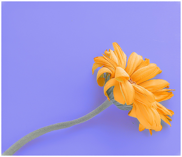
First Impression: Hah! Flower shot! 3!(j/k) It's a little gloomy for a flower shot -- which gets my vote! 7 or 8, 'cuz gloom rocks.
Composition: 5 or 6. There's too much headroom, IMO. But if you're going for a square crop, I guess you should align the flower diagonally.
Subject: 4. Sorry... it's a flower! I don't particularly like flowers... still, it's a dying flower. So, fine... 6.
Technical: I like what you did with the colours and the contrast. Undertone works for me. It adds a lot to the gloom. 6.
Summary: It's a flower shot. But a gloomy flower shot. In the end, you did good... I guess.;]
Disclaimer: The following crits are personal opinions, not photographic dogmas. Please see them as suggestions, not claims of mastery nor a show of hauteur.;p
Message edited by author 2006-05-12 01:53:47. |
|
 Photographer found comment helpful. Photographer found comment helpful. |
|
|
05/04/2006 12:21:08 AM |
|
Thanks. I figured the sharp edges was going to be a problem and I tried everything to try and fix that under basic editing (wasn't caused by sharpening). I thought it actually fit the image since the petals themselves were already curling up and dying. Also, I took another risk in going with the light colors and low contrast look. I thought it gave it a unique look and went well with the whole "fading away" concept. I know I suck at titles and one even commented to that effect. Anyway, I'm glad some people liked it and I got a fav and some 10s out of it. |
|
|
|
05/03/2006 09:29:41 PM |
|
This, to me, is a stunning shot. I like the crispness of it. Only reason I can think of that it didn't do better is folks may have been looking for bolder complementary colors, though I think the colors you have here meet the definition quite nicely. Good work! |
|
| Photographer found comment helpful. |
Comments Made During the Challenge  |
|
|
05/02/2006 10:52:12 PM |
|
Seems a bit over-exposed. Just my opinion. :) |
|
| Photographer found comment helpful. |
|
|
05/02/2006 10:16:39 PM |
|
Nice color and composition, seems a bit over sharpened. |
|
| Photographer found comment helpful. |
|
|
05/02/2006 07:38:46 PM |
|
I like the colors used for this. |
|
| Photographer found comment helpful. |
|
|
05/02/2006 02:09:37 PM |
|
Some minor distractions but otherwise a nice photo. |
|
| Photographer found comment helpful. |
|
|
05/02/2006 12:31:37 PM |
|
too washed out--would have been a nice composition. |
|
| Photographer found comment helpful. |
|
|
05/02/2006 09:45:19 AM |
|
Nice, sharp detail and a pretty arrangement. Maybe a bit too much space at the top - a tighter crop would emphasize the flower more. |
|
| Photographer found comment helpful. |
|
|
05/02/2006 02:18:16 AM |
|
nice pic... bit plain tho |
|
| Photographer found comment helpful. |
|
|
05/01/2006 11:32:06 PM |
|
Simple but elegant ... I like it. Good color combination and contrast. Clone out some of those imperfections and clean up noise and submit for stock - I bet this would do great as stock. |
|
| Photographer found comment helpful. |
|
|
04/30/2006 07:37:40 PM |
|
These colors all work well together, which is rare. Bravo! |
|
| Photographer found comment helpful. |
|
|
04/30/2006 06:50:53 PM |
|
This has a nice pastel look to it. I'm not quite certain though how it seems to look a bit oversharpened to me. You can see fringing along the edges of the petals. 6 |
|
| Photographer found comment helpful. |
|
|
04/30/2006 04:41:12 PM |
|
Pretty colors, maybe a bit over sharpened, 7 |
|
| Photographer found comment helpful. |
|
|
04/30/2006 04:38:23 PM |
|
nice shot, it is very sharp and the texture seems so delicate |
|
| Photographer found comment helpful. |
|
|
04/30/2006 02:04:48 PM |
|
| Photographer found comment helpful. |
|
|
04/30/2006 08:50:35 AM |
|
fits the challegne but very uninteresting. ry boosting color. title doesnt work here. focus is good. 5. |
|
| Photographer found comment helpful. |
|
|
04/29/2006 09:16:56 PM |
|
This could use a bump in contrast and maybe a little less sharpening. |
|
| Photographer found comment helpful. |
|
|
04/29/2006 02:04:55 PM |
|
I love the sharpness of this photo, very lovely ;) |
|
| Photographer found comment helpful. |
|
|
04/29/2006 01:37:46 PM |
|
better saturation would help/ |
|
| Photographer found comment helpful. |
|
|
04/29/2006 08:39:43 AM |
|
Except for the scratch in the upper left which is distracting this is fabulous! Love the periwinkle blue! |
|
| Photographer found comment helpful. |
|
|
04/29/2006 06:26:18 AM |
|
This photo is a bit bland... The flower is a bit washed out too. Had the colors been more robust, and had the artifacts of the image not been present, then I think the image would have commanded a 10. It's a solid 8. |
|
| Photographer found comment helpful. |
|
|
04/29/2006 05:39:38 AM |
the effect made it look soooooooooo super soft!
(^o^) |
|
| Photographer found comment helpful. |
|
|
04/29/2006 01:57:15 AM |
|
This looks a little oversharpened perhaps... |
|
| Photographer found comment helpful. |
|
|
04/28/2006 01:46:52 AM |
|
| Photographer found comment helpful. |
|
|
04/27/2006 11:44:25 AM |
|
| Photographer found comment helpful. |
|
|
04/27/2006 09:36:52 AM |
|
This is very pretty. The paleness of the colors works. Great sense of diagonal line. The undulating movement of the stem is nice. Might be my favorite flower of the challenge. |
|
| Photographer found comment helpful. |
|
|
04/27/2006 08:32:15 AM |
|
love the softness in the photo |
|
| Photographer found comment helpful. |
|
|
04/27/2006 04:47:21 AM |
Lovely!
very good lighting |
|
| Photographer found comment helpful. |
|
|
04/27/2006 12:20:50 AM |
|
Understated elegance that doesn't hurt my eyes! 7 |
|
| Photographer found comment helpful. |
|
|
04/26/2006 06:20:27 AM |
|
I was going to say, on first look, this is way oversharpened, but on a closer inspection I think it suits the shot...only distraction is the shadow...if you pulled back the flower the background would have been out of focus enough to eliminate that...I like it 7 |
|
| Photographer found comment helpful. |
|
|
04/26/2006 05:56:05 AM |
|
4 - Nice composition. Looks a bit 'flat' and the color is 'off' and seems 'blown' as well. |
|
| Photographer found comment helpful. |
|
|
04/26/2006 03:59:23 AM |
|
bit too bright and too much off center |
|
| Photographer found comment helpful. |
|
|
04/26/2006 02:15:18 AM |
|
(a little sad in a good way)good composition and very nice colours here |
|
| Photographer found comment helpful. |
Home -
Challenges -
Community -
League -
Photos -
Cameras -
Lenses -
Learn -
Help -
Terms of Use -
Privacy -
Top ^
DPChallenge, and website content and design, Copyright © 2001-2026 Challenging Technologies, LLC.
All digital photo copyrights belong to the photographers and may not be used without permission.
Current Server Time: 06/29/2026 12:19:17 AM EDT.