Author Thread
Post actions
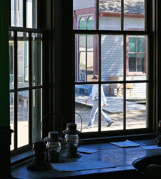
I picked this as a top 3. I love the composition (rule of thirds inside a rule of thirds) and your colors give this a sureal "painting" feel. The balance between the outside and inside light is perfect. Not showing the face give this an air of mystery - I think showing his face would have ruined this photo. There are times to break established rules and this is an example. Keep shots like this coming, even if they are not always rewarded with high scores.
Comments Made During the Challenge
Post actions
intresting view. A bit on the grainy side tho. 6
Post actions
Too bad the windowpost cuts through the mans face like that, would have been cool if you had been able to get up a little higher for this shot.
Post actions
It sure feels like 1800's. Nice picture
Post actions
I'd have prefered it if the gentleman's eyes were visible.
Post actions
A bit higher or lower to get the person's head out of the mullions would be perfect. Very nice still.
Post actions
You cut the head of the guy that is walking there and he is the only thing that looks like a good subject here. To much noise also.
Post actions
Post actions
Good exposure. Would be great if the man's face was not as cut off by the framing. nice work.
Post actions
Too bad the walker wasn't positioned more strategically inside of a window pane.
Post actions
Post actions
Nice, but would have been nice to not have obstructed the person's face...





 Add photograph to your favorites
 Add photographer to your favorites


 Photographer found comment helpful.
