|
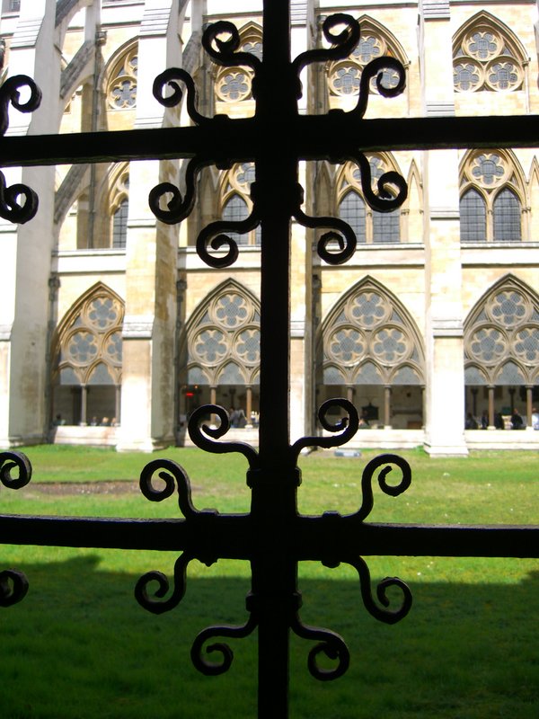
Overall, this is an interesting composition, the shapes in the centre adding interest, and, for me, dividing the image in an interesting way. However, the lack of exposure makes the foreground quite heavy compared to the building in back, and, as kenskid mentioned, the uneven focus enhances this effect. Lighting overall isn't the best in this picture; the sunlight has created harsh shadows on the grassy area that detract somewhat. Maybe it would have been interesting with a crop that used just the top shape, and with corrections for the focus and exposure. Still, an interesting looking image. |