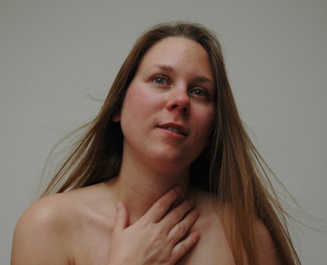
Thanks to my favorite lady for giving this a go. Lit from the upper, side from a bounced flash and from the other side by a simple light bulb bounced off the ceiling. I used a box fan from the floor aimed up as she sat at the edge of the bed.
Photoshop: curves, clone, crop, resize, post
[after challenge]
Yes, clearly this is underexposed. It is regretable since I like so much about the photo. Somehow I always manage to miss something while stressing some other part of the photo. This was quite spur of the moment and I hadn't spent a whole lot of time exploring angles and correcting my exposure. Thanks to all for the comments.
Statistics
Place: 185 out of 199 Avg (all users): 4.6107 Avg (commenters): 4.5385 Avg (participants): 4.3739 Avg (non-participants): 4.7959 Views since voting: 1037 Views during voting: 385 Votes: 262 Comments: 16 Favorites: 1 (view)
nice colour and image, but a little flat. the background looks like it wants to be white, but is just a little under exposed. perhaps levels could have fixed this? are the eyes slightly out of focus?
Try this: in Photoshop, copy main layer to a new layer, gaussian blur at about 5-10 or so (I'd need to play with it full size to know for sure) set layer blending to Soft Light. Pick the eraser, delete the eyes of the second layer to let the eyes from the original layer show through.
Sharpen the first layer at 100%/.5pixels/0 threshold, or to taste. This will make the eyes pop out. Crop the picture to portrait with the face in a thirds position, upper right. If you don't know what thirds is, go to photoinf.com.
Go to Layer/new adjustment layer/levels. Pring the rightmost slider over until it's at the bottom of the curve just into the black to brighten the background away from gray.
[url]//www.brizfoto.com/321901edit.jpg [/url]
Just trying to help, hope that's how you take it. Also, you may need to check your monitor calibration, this looked really dark to me.
I am trying to comment on any picture I vote 4 or less. I am not professional photog by any means, but trying to justify my scoring with the hope that it helps.
Lighting is not good enough for the portrait. The face looks little bit OOF.
Next time try angling her shoulders so that she is not posed so square to the camera. Also, her hand being cut off by the crop makes it look a little disembodied. I might leave more room below her and take some off the top. Lovely model and a very nice expression.
I think the pose here is a good idea. I think I'd like the camera raised up a bit so that it's more level with her face and the whole thing seems a bit underexposed.






 Add photograph to your favorites
 Add photographer to your favorites


 Photographer found comment helpful.


