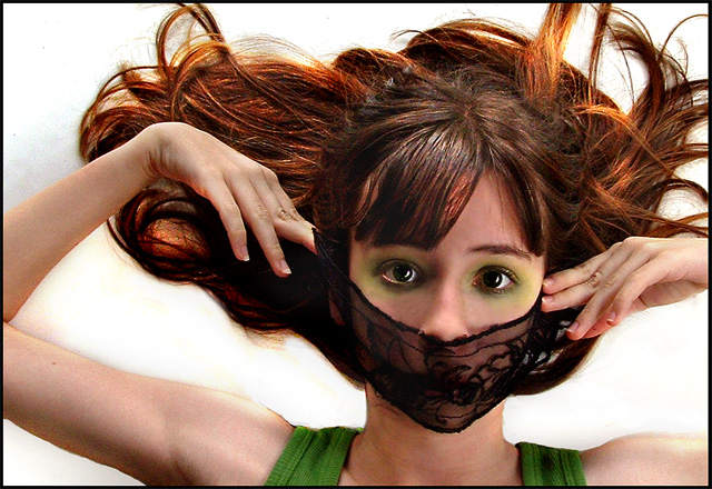
Color Studio Potrait? Come on, ya know I had to enter THAT ;-) But really, this'll be the last self potrait for a while, hopefully. So, okaay...yes, yes..I know it's over-edited (especially the background), but there were a lot of nasty shadows that were ruining the effect I wanted.
The setup you ask? Fairly simple. I laid the boogie board on the floor of the balcony, placed tripod w/ camera over boogie board, set self timer, layed on boogie board, and hoped the camera wouldn't come loose and smash my face in. I literally only took one picture cause the camera was making me nervous :-P
Okay, editing: contrast, saturation mostly, with some cloning. I brightened the bg seperately and used the clone tool to get rid of some pesky shadows.
post: haha, wow. I looked at this on the other computer after the challenge started and was like "oh. crap. that sucks." :-P Yeah..apparantly this monitor needs to be calibrated, as it looked perfectly fine here. Aw, well. Thanks for the votes and comments everyone.
Statistics
Place: 70 out of 199 Avg (all users): 5.8266 Avg (commenters): 6.8571 Avg (participants): 5.5221 Avg (non-participants): 6.0443 Views since voting: 1220 Views during voting: 542 Votes: 271 Comments: 17 Favorites: 0
:-0 that beautiful face was yours?!?! ;-) Nice job Anna! wish your monitor had been calibrated so we could see your full potential at this challenge, but none the less, i really like it... alot! Nice job, and can't go wrong with the self portraits... Nothin wrong with the cute vote Anna ;-)
Anyway, the composition, lighting, and contrast are all very nice, as well as the use of the green in the shirt and the tie into the color of eye shadow. The focus on the face seems to me a bit soft, but at the same time not so bad.
Very cool! Great color. A tad sharper might have helped, and it seems just the faintest bit grainy. The edges of her arms also seem to have strange lighting and contrast issues, but still I really like this one. -6





 Add photograph to your favorites
 Add photographer to your favorites

 Photographer found comment helpful.


