First of all, you have a wonderful shot.
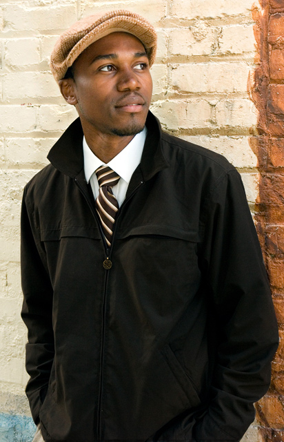
Like how he is looking away. I also like complimentary lines. The pockets on his jacket and the collar of his shirt, jacket and tie. Also horizontal line on the jacket and the blocks in the building, in shapes of the mustache and the brim of the hat.
Things that might improve this shot would be removing the blue and maybe the brown edge. The blue really has no point of interest to me. His hands are out of the shot, maybe just cropped out. The brown edge is so far over, might as well not even be there or moved Him, to lets say a third of it.
I seen in your comments box that his hat blended in with the bricks, burn and dodge are ok, but you can just use a curves adjustment to change also. Simple S curve and when your done, in your mask paint with black over everything but the wall and man this is so much easier. Thus giving more contrast. And reducing the halo look around the hat.
I like this shot a lot. I like that it is outdoors and that he is looking at something out of our sight. I think the outfit makes me feel like this might be a magazine/catalog ad, but it's very nicely done.





 Add photograph to your favorites
 Add photographer to your favorites

 Photographer found comment helpful.


