| Author | Thread |
|
|
04/24/2006 10:57:02 AM |
|
 Photographer found comment helpful. Photographer found comment helpful. |
|
|
04/24/2006 02:53:59 AM |
|
Such an underrated portrait. The "busy" aspect to this worked so well I thought. |
|
| Photographer found comment helpful. |
Comments Made During the Challenge  |
|
|
04/23/2006 10:36:48 PM |
|
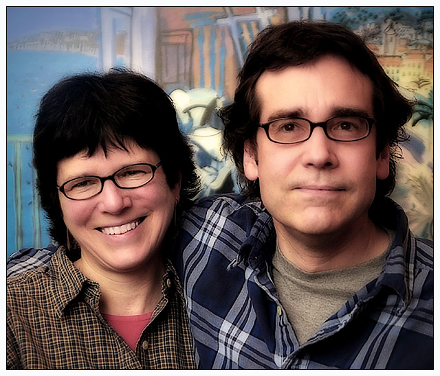
Pam and Greg don't appear to be very connected---and...what about that background? Esp with the different plaid shirts? |
|
| Photographer found comment helpful. |
|
|
04/23/2006 07:27:57 PM |
Nice composition and lighting. Remarkably rich colors.
I fear you might get hit with a few "DNMC!"s as it definitely does not look like an actual studio setup. If it is, I want that backdrop!
Only other comment would be that the post-processing seems a bit extreme.The glow effect, in my opinion, detracts from the image. |
|
| Photographer found comment helpful. |
|
|
04/21/2006 07:19:43 PM |
|
Nice warm image and good capture - seems to grab there personalities very well. I just have a few suggestions. 1) the combination of shirts and background is just WAY too busy, solid color background and active shirts or vice versa would have worked better. 2) a little heavy on the post processing. Fun pic though - I hope they liked it! (that's all that really counts you know) :-) |
|
| Photographer found comment helpful. |
|
|
04/20/2006 01:30:10 AM |
|
Like the look. The colors and tonality are great as is the composition. 8! |
|
| Photographer found comment helpful. |
|
|
04/19/2006 02:52:51 AM |
|
| Photographer found comment helpful. |
|
|
04/19/2006 02:46:08 AM |
|
A fun picture with a very cool background - 8 from me! |
|
| Photographer found comment helpful. |
|
|
04/18/2006 11:05:55 PM |
This looks like an impromptu snapshot rather than a studio portrait.
It would help if the background was less busy or more blurred. |
|
| Photographer found comment helpful. |
|
|
04/18/2006 05:46:15 PM |
|
| Photographer found comment helpful. |
|
|
04/18/2006 10:13:48 AM |
|
good lighting; I would have had him turn his head a little to his right and tilted toward the lower shoulder |
|
| Photographer found comment helpful. |
|
|
04/18/2006 07:56:26 AM |
|
The pose, expression and color make me want to give this a higher rating. But ... there's just so little detail left in the blacks (in their hair). The tops of their heads are just globs of black on my screen... I can't tell if gaussian blur was applied (kinda looks like it) or if the contrast was just boosted too much. Anyway, I'd prefer to see hair detail rather than helmets. |
|
| Photographer found comment helpful. |
|
|
04/18/2006 12:45:01 AM |
I like this photo... The hair is a bit overdone as far as contrast is concerned; there is no detail to it.
Please forgive me for saying that it reminds me of the Griswalds in the National Lampoon movies, which made me laugh hysterically. Thank you. |
|
| Photographer found comment helpful. |
|
|
04/17/2006 10:33:53 PM |
|
imo, the use of softness is overplayed entirely too much. the background is busy and distracting. |
|
| Photographer found comment helpful. |
|
|
04/17/2006 02:54:13 PM |
|
Overly post process IMO. Makes it look unnatural. Otherwise a worthy photo. |
|
| Photographer found comment helpful. |
|
|
04/17/2006 01:57:22 PM |
|
the background and clothing are all a bit too busy. It takes away from your subjects. |
|
| Photographer found comment helpful. |
|
|
04/17/2006 05:58:48 AM |
|
His face just look all srtificial. I'm not sure what you've done but the hairline looks odd and there's almost a double exposure look abut ti |
|
| Photographer found comment helpful. |
|
|
04/17/2006 01:16:24 AM |
|
If there had been a plain dark background, I think this would have been much improved. I like the expressions, and the mood, which speaks of a real bond of affection between them. |
|
| Photographer found comment helpful. |
Home -
Challenges -
Community -
League -
Photos -
Cameras -
Lenses -
Learn -
Help -
Terms of Use -
Privacy -
Top ^
DPChallenge, and website content and design, Copyright © 2001-2026 Challenging Technologies, LLC.
All digital photo copyrights belong to the photographers and may not be used without permission.
Current Server Time: 06/28/2026 06:24:56 AM EDT.