I am getting tired of myself, when I shoot for DPC I am only thinking "What will they think, what will they vote" and I am always aiming for at least a 6.
Never take any risk, stay on the safe side.
So DPC has become my prison, something to break out of.
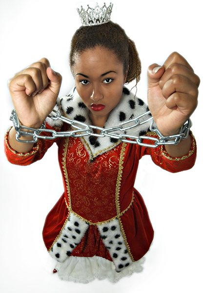
Here is my try at being myself, my try at showing myself that DPC is a game, and you have to have fun creating photo´s.
The original idea was to let her break the chain, but it wasn´t working.
I wanted to do something a bit different, an bit more me.
I also have this very sweet outtake, that will probably do better in this challenge, then again, I took this just to be unsafe and I would not be true to myself if I would choose the safe route again.
Here we go DPC, bye bye avg votes received...
On the other hand, DPC is a strange place, there could be a message in this photo that I didnt see, and it could ribbon... Haha I dont think so. I´ll be happy with my results, I had fun creating it.
Statistics
Place: 46 out of 199 Avg (all users): 6.0958 Avg (commenters): 7.5000 Avg (participants): 5.8440 Avg (non-participants): 6.2763 Views since voting: 1935 Views during voting: 465 Votes: 261 Comments: 18 Favorites: 0
First of all if this would have been in the right challenge it probably would have done really well. It does have story to it, one a fantasy look to it. So I will try to critique, as if it was in this challenge.
Your lighting looks ok, maybe a touch softer. Colors are good. Your model expression could have been more sad. Than a look of you want to fight, because if you put boxing gloves on instead of chains, looks like she's ready to rumble. I still think you could have used a shot like this, like the one in your portfolio. With the chain coming right out from under the dress and leading out of the picture and still keeping the story book feel to it.
I do see some imperfection in your shot, this is her right hand area around the knuckles. It looks a little strange and her relationship to the background, it looks more like clip artish. ( is that a word, is now ) I think some more depth would have help here, or even blurring in Photoshop in the bottom half.
If you have any question about my comment please ask me
This is a cool photo. I like the composition alot, but the background seems really unnatural for some reason. Not sure what it is, but lacking shadow or depth or something. Other than that, I quite like it.
Nice angle. Over on the left hand you left a little bit of paint which created a bit of an unevenness. Other than that, you were able to keep the glare out of the metal, and your saturation is quite good.
Certainly original! Nice photo, beautiful colors. It makes sense that her hands are such a prominent part of the photo. The only thing I don't like is the shadow across her face.







 Add photograph to your favorites
 Add photographer to your favorites

 Photographer found comment helpful.


