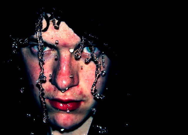
doesn't work for me, its scary, emotionally offensive, "underground" feel, if thats what your aiming for then congratulations, I'll rate alittle higher simply for the eyes!
I personally don't like this photo, it's too contrasty for my taste and is a bit discusting. If I had processed this photo then I would have saturated only his eyes rather than his whole face. The red makes me want to loose my lunch. No offense, really. It's a stunning picture, but not for me.
To be honest I don't like the look. It's those drop shadows and also the water being so sharp/in-focus in comparision to the face. Also, I'd probably not have the water running right through the eyes which makes focusing on them difficult. Anyway, just my opinion. Good luck.
Interesting, nice unconventional portrait. The red on his face seems too strong and blotchy. Nice effect with the water. Maybe this would have worked well in black adn white?







 Add photograph to your favorites
 Add photographer to your favorites

 Photographer found comment helpful.


