Hi, as requested, here is an indepth critique of your submission.
First Impression - the most important one: To be quite honest --- LMFAO! :-) Very interesting.
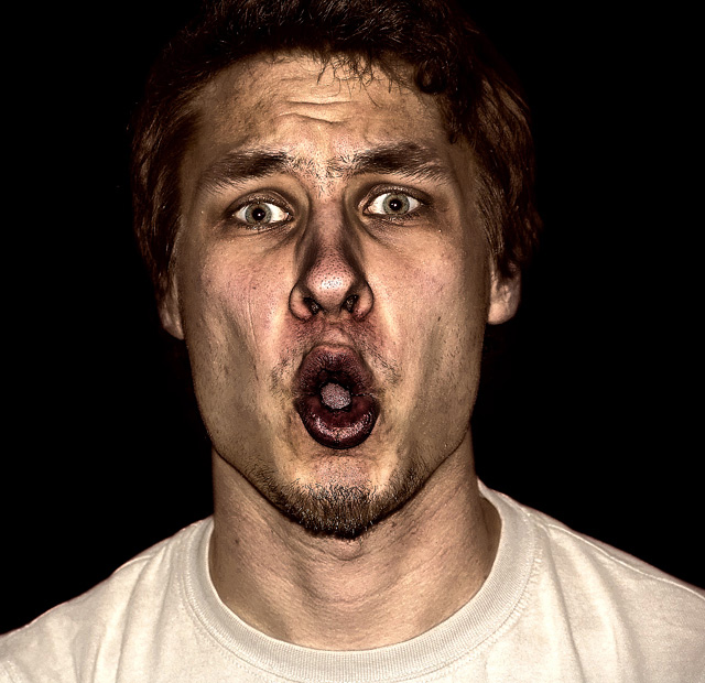
Composition: Crop here is making me feel a bit closterphobic. Otherwise, nothing wrong with it.
Subject: Hilarious :-) Technicals is that it is starting to blend with the background around the hairline, so that needs a bit of bump up (probably some dodging would do it).
Technical (Color, focus, and light): Color: I like the color treatment here, but it make have hurt you a bit in voting because of it's "un-saturated" look.
Focus: Sharp, 'nough said.
Light: Not sure if it's from the lighting or from the PP, but I find it interesting.
To grow its vote?: I said this in another critique, but hot chicks and cute kids seemed to score well in this challenge and well hell you beat me, so ya did good :-)
I like this, but I don't like this... To tell you why I would have to sit back and think about it, but by the time I thought about my answer, I think my face would look much like his. Actually, now that I've thought about it. I do like this, I'm just wishing it were a chick that looks this good. Nice job.
Sorry but the rough post processing method you used is a little bit over the top for me, I like the style but just too much, I think I would have liked this method if you had stopped halfway there if you catch my drift.
Interesting coloring -- rugged looking even. Unfortunately, the expression on the model's face makes it look more like a candid shot than a portrait, to me. I think a more *distant* pose (where it looks like the photog is almost intruding into a personal moment) would be really cool with this type of coloring.
I don't think I'm making much sense here, so feel free to ask me to clarify.






 Add photograph to your favorites
 Add photographer to your favorites

 Photographer found comment helpful.


