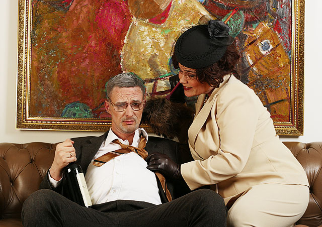
A lot of effort was put into this shoot. These are my friends who are turning 30 soon and they asked me to photograph them for their "60 year old" (2x30 years...) birthday invitation card. They got a pro make up artist to make them old (what a great job she did) and they dressed up for the occation. Then the shooting took place at her grandparents house where the interior looked a bit more elderly. We had a great time doing the photos and I really liked the outcome.
I used 2 x Bowens 500W strobes, one with an umbrella and the other with a softbox. Shot Raw. Post processing included USM, Channel mixer in diff mode, Curves and a bit of desaturation. Finally cropped a little bit and resized.
First submission in ages for me
Statistics
Place: 125 out of 199 Avg (all users): 5.3561 Avg (commenters): 7.2941 Avg (participants): 5.0991 Avg (non-participants): 5.5425 Views since voting: 902 Views during voting: 427 Votes: 264 Comments: 18 Favorites: 0
First of all, when I looked at it gave me a smile and as my eyes start to move around. The relationship between the picture and the couch are out and a little distracting.
Also if you would have moved your subjects over to your left about 6 inches this would have put his head in the red area and hers in the white. Because the green in the painting is around his head making it look strange. I know you did allot of set up for this shot, but you could always change the background to something else. Just my opinion.
His glasses seem smudged a bit I don't know if this was intentional or not. But I do know the voters see everything here.
Your lighting seems to be dead on, nothing to bright or dark.
You might also keep up your file size close to the 150K limit, so you don't loose any more detail than possible.
Over your photo has a nice funny story to it, I think you have fine image and keep up the good work. If you have any question feel free to ask.
the orientation of the image is awkward - due to the rotated painting hanging behind the subjects. But the wakwardness is caused mainly due to the combination of the rotated painting AND the tight cropping of this photo.
White balance seems a bit to the yellow side and the painting in the background is crooked. A little bit of mood lighting rather than just full on, would have made this picture pop a bit more.





 Add photograph to your favorites
 Add photographer to your favorites

 Photographer found comment helpful.


