Hi, as requested, here is an indepth critique of your submission.
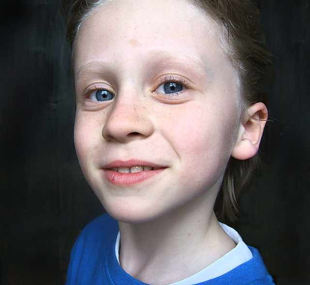
First Impression - the most important one: Nice "in-your-face" portrait of a cute young lady. The first thing that catches my eye are her blue eyes and the big square catch lights.
Composition: I like the "in-your-face" feel of this image, but the crop is making me feel just a bit closterphobic. Back off just a hair in the crop and I feel your comp would be a little stronger.
Subject: Sharp, in focus and stands out well from the background. Also, while it's not a classical portrait point of view, you have added interest to the subject by getting closer than usual.
Technical (Color, focus, and light): Color: Good, I don't see much room for improvement here.
Focus: Sharp as a tack.
Light: Looking at the catch lights I see you have most likely used window light. It worked well for you. No unflattering shadows, yet the lighting doesn't come out too flat either.
To grow its vote?: While I find the shot interesting and fresh, you possibly got some DNMC votes because of the background. It just doesn't look "studio" enough.
Summary: What can I say, I think it's well done with "limited" resources. Keep up the good work.
I have told a lot of people in this challenge that wide angle lenses are a big no no for portrait photography, unless of course you know how to use them and this is a good example of how it should be done if you want to use a wide angle, you obviously know enough about photography that you can break the rules and still make it work. Nice lighting.







 Add photograph to your favorites
 Add photographer to your favorites

 Photographer found comment helpful.


