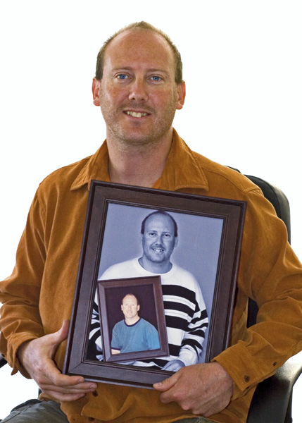
took the portrait, printed and framed, took the second one holding my framed portrait, again printed and framed. processed to B&W with the intitial one being color. printed and framed once more, to take this shot. applied levels, resize, sharpen, a bit of a sat adjust.
hope this one does better than the past ones.
Statistics
Place: 152 out of 199 Avg (all users): 5.1311 Avg (commenters): 6.3750 Avg (participants): 4.9224 Avg (non-participants): 5.2914 Views since voting: 844 Views during voting: 413 Votes: 267 Comments: 10 Favorites: 0
You know, I'm having a bit of trouble deciding why this was a 5.1. I think it's a decent shot. I gave it a 6. Perhaps two things jump out at me.
1) DPC does love a white background, but this is, if possible, too white. It almost overwhelms you. I don't think gray would have been better, but instead of having a 0.0.0 white, maybe a 15,15,15 white or something would have been better. I'm not sure.
2) The pose is a bit static. I think it's a neat idea pulled off well. Sure, it's been done before, but not enough that it has become cliche. I'm not a portrait artist, so I don't have a lot to help you with the pose, but I wonder if that was part of the problem.
3) I'm really puzzled by the 60 scores of 4. I really don't know. Sometimes you win, I guess and sometimes you lose. Keep it up though.
Not raelly fond of the composition here, you cut off parts of both his hands but just barely, I think it´s ok to do that when you really take big parts off but this just looks accidental or that you didn´t have enough space to back off from him (yourself) Also the lighting isn´t really doing anything from me, I would suggest some way to light his face more and with softer lighting, doesn´t have to be complicated, just bounce a flash on a diffusing reflector a little bit from above.







 Add photograph to your favorites
 Add photographer to your favorites

 Photographer found comment helpful.


