| Author | Thread |
|
|
04/25/2006 02:14:11 AM |
::: Critique Club :::
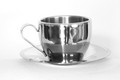
Hi, my name is Kari and from the critique club.
First Impression - the most important one:
The black and white mood kills this shot in a lot of ways .. it is hard to define what each of the parts are through the melding of their colours.
Composition:
The composition is fine ... but think about the following when composing a shot:
Composition is about leading the eye into an image (painting or photo). Research shows that the eye enters bottom left and travels up to top right ("Leading Lines Rule"). Once in there, the same research tells us that the eye finds comfort when the point of interest (POI) sits on a thirds line or intersection ("the Rule of Thirds").
Subject:
Because of the colour I can't tell that it is crome ... this may have further confused the voters.
Technical (Colour and light):
Lighting is fine, but as mentioned colour would be great.
To grow its vote?:
Take note of what people say .. and have a look at the winning shots to see what you missed.
Summary:
Good solid shot, not your highest scoring ... and you have built up some fantastic pics.
Think about when black and white is appropriate .. and what you are using it to help convey.
If you've got any questions about this critique, please feel free to contact me via the PM system.
Cheers
Kari |
|
Comments Made During the Challenge  |
|
|
04/18/2006 09:15:20 AM |
|
I don't know what it is, but I like it... |
|
|
|
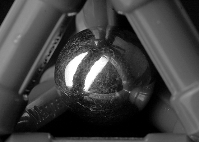
04/16/2006 02:37:17 PM |
Fits challenge=5
Color/lighting=0
DOF/focus=1
Wow factor/uniqueness=0
Attractiveness=0
Interesting, the greys seem a little muddy, maybe a little boost in contrast could help that and help see a little more around the center ball. The ball is nicely framed and has good detail...actually probably a bit too much considering how scratched it is. A nice clean crisp one would be preferred. |
|
|
|
04/13/2006 05:23:00 AM |
|
Very nice idea. It's too bad the ball is scratched up like that, but it doesn't seem like you could have done much about it. Good symmetry. |
|
|
|
04/12/2006 09:49:49 AM |
|
Hard to see the levitation happening--too bad the ball isn't more polished. Image could be a little brighter. |
|
Home -
Challenges -
Community -
League -
Photos -
Cameras -
Lenses -
Learn -
Help -
Terms of Use -
Privacy -
Top ^
DPChallenge, and website content and design, Copyright © 2001-2026 Challenging Technologies, LLC.
All digital photo copyrights belong to the photographers and may not be used without permission.
Current Server Time: 06/28/2026 11:11:45 PM EDT.