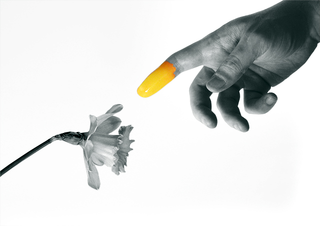
I liked this one as it was not the typical flower shot. Not much I could add to make it "better" as I couldnt have done as well myself. The sharpness inthe hand and flower was good and I didn't have an issue with the light background. I don't believe a dark background would have given the same if not better effect. Nice job.
I don't know why, but the more I look at this the more I like it. Wish I had voted it higher then I did. At first glance it looks rather blah from the desat, but it really is quite interesting as I look at it more deeply. I feel that I just want that color to finally reach the flower so the flower would burst with it! Nicely done!!
I skipped voting on this one, sorry, though it is technically very nicely done, I did NOT like it. So, as I refuse to give a good image that meets the challenge a low score, I just skip them, wish others would do the same, btw!! Anyway, FIRST thing I thought of when this photo came up during voting was "E T ripoff", understand that it very well may not be, but that is all I saw in it. I am sorry that I do not like it, but..... people are different. AND, I do say, it is WELL done!
Not sure what to do to "make this better" - I think some have mentioned a dark background, but I think the use of a light background works well with your theme. I really did like this when voting - still like it. I think it's very well done.
I think a tighter crop would have helped. There does seem to be a lot of space with no purpose. Excellent idea which was probably hit a little hard due to the "theme" of creation.





 Add photograph to your favorites
 Add photographer to your favorites

 Photographer found comment helpful.


