| Author | Thread |
|
|
04/10/2006 11:26:34 AM |
|
 Photographer found comment helpful. Photographer found comment helpful. |
Comments Made During the Challenge  |
|
|
04/09/2006 05:06:25 PM |
|
| Photographer found comment helpful. |
|
|
04/09/2006 11:34:41 AM |
|
good use of geometric shapes, striaght lines -- one of my favorites this challenge |
|
| Photographer found comment helpful. |
|
|
04/07/2006 05:09:44 PM |
|
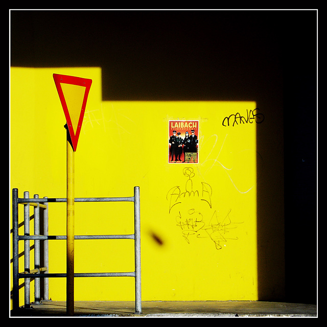
Great composition with that shadow stair. The poster, fence and traffic sign are well balanced within that. 10 |
|
| Photographer found comment helpful. |
|
|
04/06/2006 07:10:09 PM |
|
Whew, it certainly meets the challenge! I really like the angular, structured feeling of the image. It has nice modern tones because of it. The graffiti is a bit distracting from that since the shapes of that are more organic, but the band flyer really works with that feel too. That dark blotch in the middle of the image is unfortunate. Not sure if that's something odd on the lens or a shadow from something or what but it breaks the image up and is very distracting. Good eye nonetheless. I gave a 5 |
|
| Photographer found comment helpful. |
|
|
04/05/2006 12:39:55 PM |
|
There's a kind of rough industrial ugliness to this photo that makse this seem like a really good place to avoid. The way the shadow defines the space and the way it echoes the railing simply makes the photo. Very nicely observed. |
|
| Photographer found comment helpful. |
|
|
04/04/2006 11:08:44 AM |
|
You have composed this really well..... |
|
| Photographer found comment helpful. |
|
|
04/03/2006 01:21:17 AM |
|
nice and simple clear and effective...great lighting and composition |
|
| Photographer found comment helpful. |
Home -
Challenges -
Community -
League -
Photos -
Cameras -
Lenses -
Learn -
Help -
Terms of Use -
Privacy -
Top ^
DPChallenge, and website content and design, Copyright © 2001-2026 Challenging Technologies, LLC.
All digital photo copyrights belong to the photographers and may not be used without permission.
Current Server Time: 06/29/2026 11:10:49 PM EDT.