Greetings from the Critique Club!
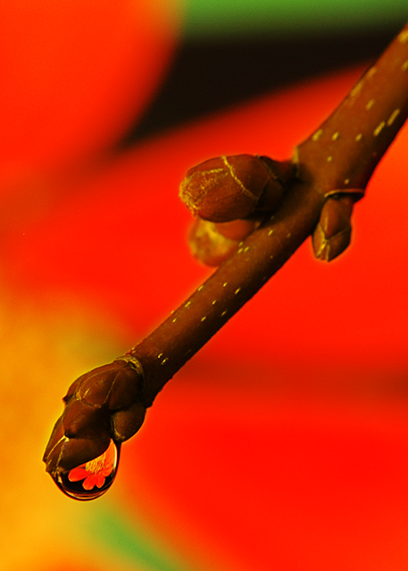
Your entry is a lovely example of an almost stylized macro, with pleasant composition, wonderful colour choices, and a thoughtful execution. The position of the twig at a downward diagonal through the frame makes for an overall well-balanced image, dividing the picture into almost equal segments in a pleasing way. The coloured bokeh of the flower is striking, its smoothness offering a nice contrast to the rougher texture and colour of the wood. The buds, as they point to the lower left of the image, offer interesting tension against the flower petals which seem to sweep to the upper right. Your choice not to make the subject of the image - the very clever drop of water - dead centre is of course the correct one: we are forced to discover its delightful surprise on our own. Even the shape of the image within the drop is great, almost echoing what we think of as the shape of a flower petal.
The red works, but I am wondering if it is perhaps overpowering. It almost deflects attention away from the the composition as a whole, and certainly has the effect of darkening the twig. It may have helped to apply Curves or similar to tone down the red with some restraint (although, with this image, you may have chosen to do the opposite). The large dark area at the top, for me, detracts somewhat; it would have been ideal if the petals were as close together at that point as they are further down. If that were the case, the entire image would have a resounding balance that may have given a stunning effect, in my opinion.
Overall, a great image, and a wonderful "wow" on first view. Congrats!
Hope this helps,
Louis |