You have chosen a different interpretation of the Comfort Challenge, and it looks as if it was received with mixed response by our voters.
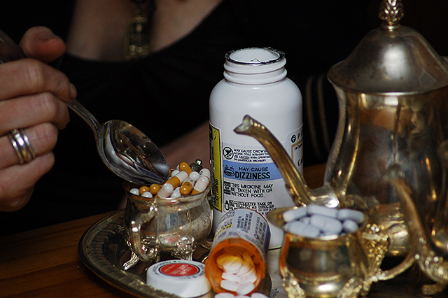
Technically, a still life of this sort usually is tack sharp, especially in the foregound, but your aperture of 4.8 offered up a shallow depth of field with "Dizziness" being the sharpest point. When viewers must puzzle out what is directly in front of them, they sometimes just don't take the time to do so. And of course, "Dizziness" doesn't exactly spell comfort to some voters.
Just one last thing - when you look at the top placement images on DPC, you may notice that many of them are extremely simple. you managed to put quite a bit of detail in this image, and my suggestion would be to try to recreate this image removing information until the minimum is reached to tell your story.
Okay, I'm running off at the mouth this morning, and probably should take my own medicine and simple down this critique. :)
But I'm going to send it along anyhow.
I wish you well in future Challenges and look forward to seeing more of your work. You have a unique way of seeing and that goes a long way at DPC.
To me this is a scary concept. Hence, little feeling of comfort. Technically a good photo, but it represents something disturbing. In particular, the "may cause dizziness" lable.
This is a sad source of comfort. :-( The DOF is a little too shallow. The blue pills in the forground should be just as sharp as the other ones further back.
What a sad social commentary :) If you'd managed to get all of the foreground pills in focus too this would be a winner. Since you couldn't, I would have taken away those elements that were OOF







 Add photograph to your favorites
 Add photographer to your favorites


 Photographer found comment helpful.


