| Author | Thread |
|
|
03/06/2006 01:03:03 PM |
Greeting From The Critique Club!!!
Initial Imapact: eehh... nice color......
Meeting the challenge: It definately does. I can't agrue with that.
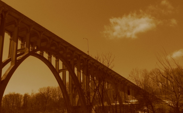
Color: Sepia was a good choice for this image but I think the color may be just a little too saturated. Toning it back a little might help this get more of the rustic photo feel.
Contrast: Not a whole lot of contrast her exept for the dark on sepia. I think this could have benifited fro an little bump in the contrast. It would have brought aout eh details better on both the bridge lines and the trees. As it is the image feels flat.
Focus: Not to bad but it looks to be just a little soft. Once again causing you subject to fad a bit to much into the background.
Composition: The composition dosn't sit very well with me. The bridge running from corner to corner. It feels like it is running of the page. It no longer feel s like the center of intrest. This would have greatly benifited with a bit less of an angle on the bridge and a little smething to help anchor the subject down in the middle a bit more.
Overall. The copostion is a big draw back. This could probably have been compensated for by bumbing the contrast and easing off the sepia a bit. Not a bad image but with a little Time and effort this could have been a great photo.
Tristalisk |
|
Comments Made During the Challenge  |
|
|
02/27/2006 07:15:50 PM |
|
Its a beautiful photo but I am not sure this tone gives it justice. Its sort of like looking through a smoggy haze. |
|
|
|
02/25/2006 08:29:02 PM |
|
Seems a litte out of focus the tone seems a little to yellow. Picture is layed out good. |
|
|
|
02/23/2006 10:39:40 PM |
|
I like the shot of the bridge but I think the color is horrible. It makes the sky look very poluted. |
|
|
|
02/23/2006 10:38:37 PM |
|
 Photographer found comment helpful. Photographer found comment helpful. |
|
|
02/23/2006 10:24:56 PM |
|
| Photographer found comment helpful. |
|
|
02/23/2006 10:19:31 PM |
|
Very vintage looking. Interesting lines. My problem with this is there isn't anything that holds my attention. The lines help and it leads my eyes through the photo but I don't end up in an area of interest. I think maybe this would work better if the goal was different. As it stands now it's a very moody shot but the subject seems to beckon for something else. Does that make sense? |
|
| Photographer found comment helpful. |
|
|
02/23/2006 05:36:03 AM |
more brightness and contrast would make this photo very good, so far 3 :-)
peace |
|
Home -
Challenges -
Community -
League -
Photos -
Cameras -
Lenses -
Learn -
Help -
Terms of Use -
Privacy -
Top ^
DPChallenge, and website content and design, Copyright © 2001-2026 Challenging Technologies, LLC.
All digital photo copyrights belong to the photographers and may not be used without permission.
Current Server Time: 06/28/2026 04:37:26 AM EDT.