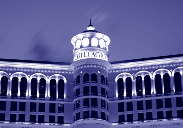
"Blue Bella" is nice entry into the Duotone challenge. I remember this shot because I have personally wanted to go to the Bellagio for so long. I really like your choice of blue, it seems very appropriate for the subject. The other color options would probably have the image with a very different and not as appealing feel.
The photograph itself is overall appealing. Very nice time of day to take the shot. The lighting on the building is accenting the structure very nicely. The light at the top of the tower looks a little bit over blown. Also the sky looks very processed, I am not sure if it is the time lapse or just the editing. Its not too distracting at first glance, but when you spend some time with the image it starts to pop out. Overall the image is still nice and I could see it making a nice postcard. Keep up the good work.





 Add photograph to your favorites
 Add photographer to your favorites

 Photographer found comment helpful.


