DPChallenge: A Digital Photography Contest You are not logged in. (log in or register
 
Challenge Entries
Portfolio Images
This image is not part of a public portfolio.
The best looking decade
Hordur Ace


Photograph Information Photographer's Comments
Challenge: The 80s (Advanced Editing IV)
Camera: Canon EOS-20D
Location: Studio 16
Date: Feb 19, 2006
Aperture: f 7.1
ISO: 100
Shutter: 1/200
Date Uploaded: Feb 19, 2006

i wasnt sure what picture i wanted to send to this contest hope you like this one..

Statistics
Place: 21 out of 101
Avg (all users): 5.8889
Avg (commenters): 6.7778
Avg (participants): 5.6491
Avg (non-participants): 5.9624
Views since voting: 1116
Views during voting: 525
Votes: 243
Comments: 13
Favorites: 0


Please log in or register to add your comments!

AuthorThread
03/01/2006 04:57:12 AM
propping up the end of the bar of the Critique Club

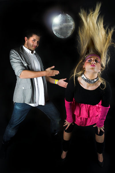
Whilst there is undoubtedly a large amount of 80's references here, and thus a strong meeting of the challenge, I do think that your oberall composition and lighting have prevented you from scoring any higher with the voters.

First off, the three elements that really draw the eye are the faces and the mirror-ball. Those elements are all gathered at the top of frame here and slightly uncomfortably arranged - her face and his face aren't balanced with the mirror-ball, and the slightly different off-sets fromm the edge of frame also i think make for some awkwardness for the viewer. The lower part of frame, your models' legs, is badly lit - simply not bright enough, I think, and disappearing into black. That effect has the beginnings of the idea of night-club lighting, but the lack of very tighly focussed light and of any colour doesn't help with that overall effect and it ends up feeling like a mistake.

I think, perhaps, more effect could have been generated by not simply including all of the models. You seem to have framed this to get all of them in - head to toe; but what's actually important, to my eye, is only certain elements of their clothing - the skirt, her make-up, his rolled up sleeves. The overblown poses are effective for the period, but again, I don't think it entirely necessary to have full body shots to communicate that.

Perhaps also, more interaction between the two would make for a more dynamic image - they seem to be in two completely separate worlds these two people, having little to do with each other.
02/27/2006 06:54:16 PM
From the picture on this challenge, it seems like the icelanders have great taste for the 80's ;)
 Comments Made During the Challenge
02/26/2006 08:44:07 PM
Nice action capture! 7
02/26/2006 08:10:56 PM
Image is a little dark. You definitely got the styles of clothing and makeup right. I don't like the placement of the models. At first glance I thought he was spanking her because of the positioning of his hands and because she is bent over. Then I realized he is probably doing that robot dance and she is in that position because you wanted to get the hair flying up. It does look odd.
02/26/2006 11:37:13 AM
flamboyance and style together
02/22/2006 08:12:03 AM
What are they doing?
02/21/2006 04:37:00 PM
The people are dressed right, but the disco ball doesn't really fit.
02/20/2006 12:51:49 PM
the disco ball is a nive touch!
02/20/2006 08:43:24 AM
OMG, is that "The Robot?"
02/20/2006 02:02:43 AM
great work...deserves to do well
02/20/2006 01:25:26 AM
Disco Fever, good image...8
02/20/2006 01:12:04 AM
ROFL I love her expression. This is a hoot. If her hair were permed - she'd really have it all!!!
02/20/2006 12:43:08 AM
Hilarious! I can't stop laughing, this is so true!


Home - Challenges - Community - League - Photos - Cameras - Lenses - Learn - Prints! - Help - Terms of Use - Privacy - Top ^
DPChallenge, and website content and design, Copyright © 2001-2024 Challenging Technologies, LLC.
All digital photo copyrights belong to the photographers and may not be used without permission.
Current Server Time: 04/23/2024 01:26:28 PM EDT.