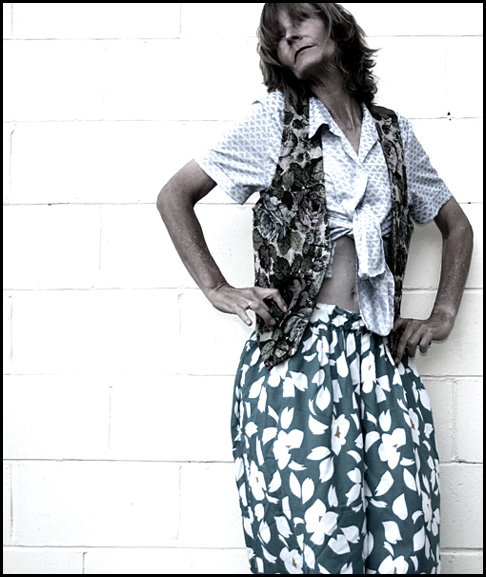
Worn to our work 'bad taste' party. Thought it was time to drag them out again. Hues/saturation, levels, selective colour, more hues/sat, usm, more hue/saturation. I had a load of fun!
Statistics
Place: 70 out of 133 Avg (all users): 5.1165 Avg (commenters): 6.4375 Avg (participants): 4.9242 Avg (non-participants): 5.1584 Views since voting: 944 Views during voting: 484 Votes: 369 Comments: 20 Favorites: 0
LOL Sue!!! :-) I never would've guessed this was you (actually thought it was Jutilda, to tell you the truth). You stepped out of your proverbial box on this one. What a fun shot!! :-)
I like the addtion of the negitive space to the left. In general, I think adding the space to the side that the person is facing would have been better, unless you are trying to get a sense of them leaving.
Not sure really antipodean (maybe my fashion sense too broad). Cinder block lost texture and washed out to where it melts into model - tends to wash out image.






 Add photograph to your favorites
 Add photographer to your favorites


 Photographer found comment helpful.


