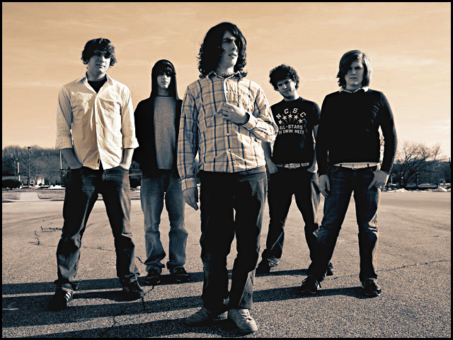
I took this picture. (i'm 2nd in from the right). Positioned the guys, then when i was set, i had a remote in my right hand timed for a 2 second delay. Took about 10 of these, this was the best one I though. Hope it does well cause I never seem to get past a 5 out of 10 rating.
Statistics
Place: 179 out of 631 Avg (all users): 5.4882 Avg (commenters): 7.0667 Avg (participants): 5.3656 Avg (non-participants): 5.6937 Views since voting: 1281 Views during voting: 391 Votes: 297 Comments: 22 Favorites: 2 (view)
Very cool shot. I think you nailed a nice band photo here. Besides bands are supposed to look bored. That is the style right now. Music isn't this 1980's party music anymore, it is what you captured in this photo.
Very nice shot, fits the challenge. I like the tight crop and the location, however I think a few things could have improved it.
As one commentor suggested, the horizon is straight across the middle of the image. Changing the angle of the camera (either higher or low) would have given a more interesting perspective. I like the sepia tone, but it is just a little bit too orange (maybe not, though).
Other than that, I'd say the band members could engage the camera a bit more. A couple of the guys look almost nervous.
Another band pic, looking like many other band pics. I like the frontman... maybe more could have been made of his forlorn/wistful expression, although his hips have been posed awkwardly. Everyone else looks quite stiff/bored. Not sure I like the brown/orange sky. My main criticism is that this photo tells me nothing about the band, it's quite bland.
I like the album cover idea. It probably would have been more effective if that crap on the left wasn't in the background and if the dudes in the band were actually in focus.
man you guys must be real losers to take a shot like this...
i mean the guy on the right in the back looks awesome and all, but you know, not the best photo ever..... (haha kidding)
yea you took it to a new level and the color tones look amazing.
-z
Very nice shot. Looks like it would make a great cd cover (which I'm pretty sure that is what you were going for :-) Exposure, focus, etc are pretty good. The duotone here I think works really well, you know, not just done for 'the sake' of doing it. It sets a good mood for this shot. With the sky, has a kind of 'surreal' look to it. I'd like to know if you specifically planned for the time of day of the shot. Why, is because I think the shadows add a lot to the shot IMO. A LOT! Gives depth, boosts interest a little, adds to the feel, and helps to give balance against the sky and creates a slight (very slight) vertical for the eye to follow across the image. Wonder, did you try a square crop? Might add to the cd 'feel' of the photo. Anyways, great job, a really nice shot, and well done. Good luck in the challenge :-)






 Add photograph to your favorites
 Add photographer to your favorites


 Photographer found comment helpful.


