Hi, as requested, here is an indepth critique of your submission.
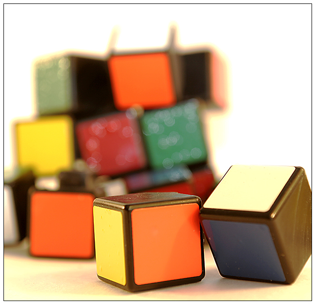
First Impression - the most important one: It is a good image and stands apart from all the other Rubik's Cube photos in that it is torn apart ... something I quickly learned to do ;-)
Composition: Pretty strong. I like the fact that the in focus parts are in the positions they are in. However, I think that using two blocks in the foreground has crowded the composition a bit.
Subject: Clean, clear crisp and stands out welll.
Technical (Colour, focus, and light): Colour- White balance seems to be a bit warm. But, overall colour is good.
Focus - Sharp and good use of DoF.
Light - No harsh shadows, evenly lit. Pretty good, but somewhat flat.
To grow its vote?: The Rubik's seems to have been an obvious choice for this challenge. In that, you may have gotten quite a few votes that were low, because voters had seen too many Rubik's Cubes. Also, strenthen up that composition just a little.
Summary: Pretty good photo, definitely not a bad photo.
Heh, poor cube. I like the idea, especially when coupled with that Relax song (Tommy TuTone?). The colors are a little bland and the lighting is a bit harsh.. making that odd yellowy undertone on the background. The focus on the front items is pretty good but I'm finding the background cubes to be more distracting than adding interest - possibly because they are out of focus due to the shallow DOF and they are such a large object in relation to the front cubes. Also there are some odd bits on the back cube clump that draw my eye. I'm not sure if that's glue or compression artificats or what. I do like the image and the idea behind it, just a few things (as mentioned above) that I'd suggest changing (if possible!) if you were to reshoot. I gave a 4.
nice image, good composition. i like the shallow focus, as well as the idea behind it (as i understand it). the glittery bits on the background blocks are a little distracting, but that's rather minor.
Oh how I wanted to tear some of those cubes apart, oh wait, I have, LOL! Great idea, good execution, wonderful DOF, just seems a tad, just a very tiny tad dull on the colors, otherwise, excellent. An 8
One of my favs so far. The title is great.. though now the song's stuck in my head. :) I like the depth, and the clarity on the front blocks. Very nice. :)
There are a lot of Rubic's Cubes in this challenge, but unfortunately, although some may have played with it in the 80's, it was really created in 1975. Therefore, the cube was really a 1970's craze, and not an 80's craze.Rubik's Cube was developed in 1975 by Ernö Rubik, a Hungarian professor of mathematics






 Add photograph to your favorites
 Add photographer to your favorites

 Photographer found comment helpful.


