| Author | Thread |
|
|
11/11/2006 04:27:35 PM |
|
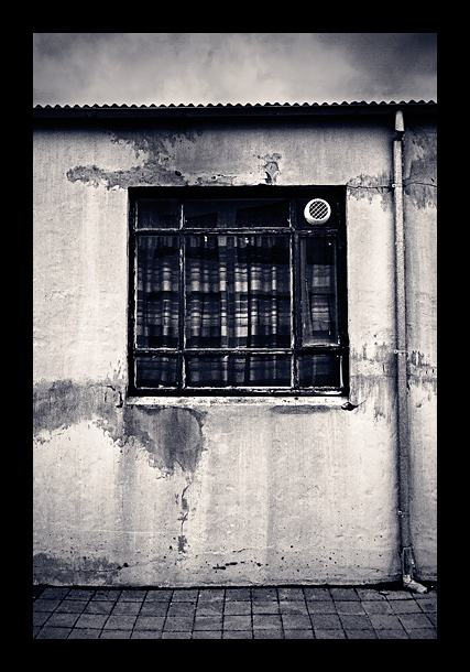
I'm with Bucket with respect to the border, but then I'm not a border person. 8) Having said that, I really like the use of b&w here. It emphasizes the forlorn look of the old building. I love the geometry -- the repeating right angles, the straight lines, the zig-zag roof and then just the tiny circle for the vent. |
|
 Photographer found comment helpful. Photographer found comment helpful. |
|
|
11/11/2006 03:57:55 PM |
ok I am no expert on anything, but the border for this feels a bit heavy for the shot...I think a nice size would be to match the black under the roof...essentially cutting the frame in half...this window seems so vulnerable, lonely, just think it looks too secure with that frame...
and after reading this you may simply agree with my original statement...
I really like this shot... |
|
| Photographer found comment helpful. |
Home -
Challenges -
Community -
League -
Photos -
Cameras -
Lenses -
Learn -
Help -
Terms of Use -
Privacy -
Top ^
DPChallenge, and website content and design, Copyright © 2001-2026 Challenging Technologies, LLC.
All digital photo copyrights belong to the photographers and may not be used without permission.
Current Server Time: 06/22/2026 06:47:36 AM EDT.