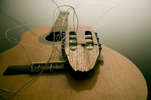
This is a great subject, the DOF is really good and the quality colour values in the wood and the light through the stings are all really good. I find the composition a little too centred and there's something (a string?) angling from the head up to top-left. It really throws the perspective of the shot. It looks like a shadown and makes the image appear to be titlted.
I like this perspective and how the body of the guitar fills up the lower half of the frame and the hecticness of the strings add the the demise of the guitar. Good job.
Flat lighting. Nice idea but it just lacks just about everything. What is the focu here? th ecolour are flat, the strings are too messy and destracting.






 Add photograph to your favorites
 Add photographer to your favorites


 Photographer found comment helpful.


