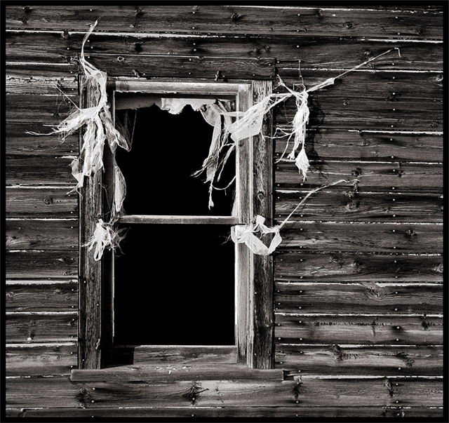
This is a beautiful picture. At first, it felt misaligned but after a moment, I could see that the boards themselves are uneven. this is really an image that repays a more careful look.
Awesome subject, nice use of thirds for the window. I haven't decided on the B&W treatment yet but I have to mention the lack of straightening. The vertical of the window shoud be either vertical or way tilted, not just a degree and a half off like this. It gives the impression that ti's a sloppy job or that you don't care - neither of which are true I'm sure.
Excellent subject matter, and a really good image as well.....I really love this simple, to the point B/W image, and I have one word to say, yes, "WOW".....One of my favorites in this challenge.
Top 5 for me! I love the darkness of the boards contrasted with the white... whatever that stuff is. The lines of nails are great, they really take this image to another level! 10.





 Add photograph to your favorites
 Add photographer to your favorites

 Photographer found comment helpful.


