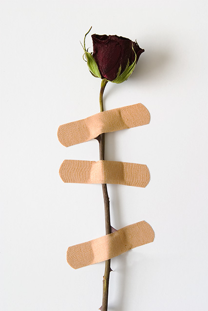
Very little editing... desaturated the bandaids a little so they weren't so hot... minor curves adjustments. Removed a line from two pieces of paper used for background.
Statistics
Place: 65 out of 285 Avg (all users): 5.5693 Avg (commenters): 7.5714 Avg (participants): 5.3069 Avg (non-participants): 5.7225 Views since voting: 1341 Views during voting: 362 Votes: 274 Comments: 16 Favorites: 4 (view)
Excellent creative response to teh challenge. If you'd used the Rule of Thirds I think it would have had even more impact as it would benefit from the extra neutral white space. You might just get close to the front page with this entry - good luck.
This is a creative, great idea. And very well-executed. I wonder if the rule of thirds. . .or making a little less dead-center would have given it even more impact ??? I like it alot tho.
Clever idea to convey the weakness of quick bandaid patches to larger problems. I like this but the composition is rather static/ centred. I wonder if a non-centred composition would strengthen this or not?





 Add photograph to your favorites
 Add photographer to your favorites

 Photographer found comment helpful.


