| Author | Thread |
Comments Made During the Challenge  |
|
|
02/07/2006 05:25:23 PM |
|
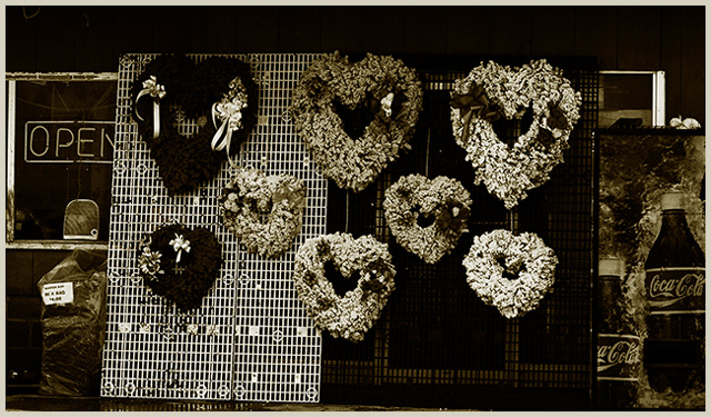
I like the dark contrasty feel of the photo. It would have been a lot better if you cropped it on both sides to get rid of the distracting coke ads and the open sign. Also need to be rotated slightly. |
|
 Photographer found comment helpful. Photographer found comment helpful. |
|
|
02/07/2006 04:28:55 PM |
|
| Photographer found comment helpful. |
|
|
02/06/2006 09:52:04 PM |
|
|
|
02/05/2006 03:09:01 AM |
|
having trouble finding an object of interest. all of the hearts are equally balanced in the center of the photograph, with no observation to the rule of thirds. good exposure, a little lack in detail |
|
| Photographer found comment helpful. |
|
|
02/03/2006 11:10:57 AM |
|
|
|
02/03/2006 01:24:34 AM |
|
Cropping out the Coca-Cola ad on the right would have improved the image. |
|
| Photographer found comment helpful. |
|
|
02/02/2006 08:29:30 PM |
|
|
|
02/01/2006 04:13:54 PM |
|
I'd expect this would be better in color, and certainly with the coke machine and open sign cropped out. Or are you just being ficicious? |
|
| Photographer found comment helpful. |
|
|
02/01/2006 05:58:41 AM |
|
i would have cropped it a bit...but thats just me |
|
| Photographer found comment helpful. |
|
|
02/01/2006 04:44:44 AM |
|
I like the b&w choice. I think it could be better if the coke machine were cropped out tho. |
|
| Photographer found comment helpful. |
Home -
Challenges -
Community -
League -
Photos -
Cameras -
Lenses -
Learn -
Help -
Terms of Use -
Privacy -
Top ^
DPChallenge, and website content and design, Copyright © 2001-2026 Challenging Technologies, LLC.
All digital photo copyrights belong to the photographers and may not be used without permission.
Current Server Time: 06/29/2026 06:57:28 AM EDT.