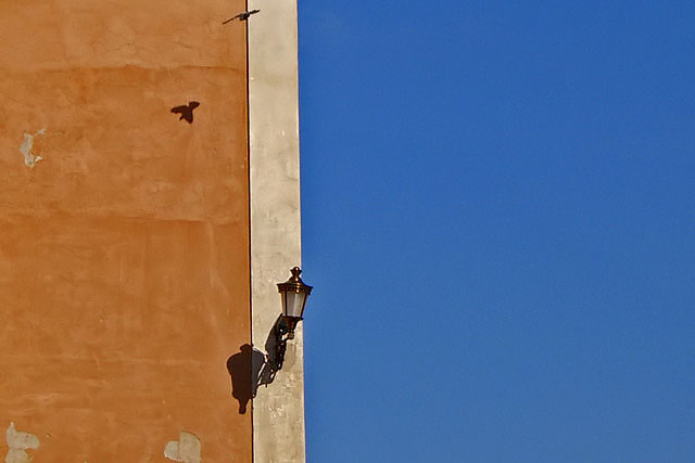
Nice juxtoposition of colors. I would have rotated clockwise, ever so slightly to straighten up the line of the wall, and possibly cropped just to the left of the bird's shadow, to put the lantern more off-center. As it is now, it's really close to being centered.
Nice colours and amazing luck to have included the bird, however I feel the image is out of balance. The gold area has some nice texture to it however the blue area is too flat and uninteresting to add much to this image. Cropping most of the blue (not all) so that it is about half the width of the gold I think would make for a much stronger image.
Ireally like the colour of the wall and the shadow from the bird. I would have preferred the ine of the building to have been perfectly vertically. I also wonder if this would have been a little more of a pleasing composition if you had arranged this in a portrait layout ... it would have emphasized the vertical lines a little more. JMO





 Add photograph to your favorites
 Add photographer to your favorites


 Photographer found comment helpful.


