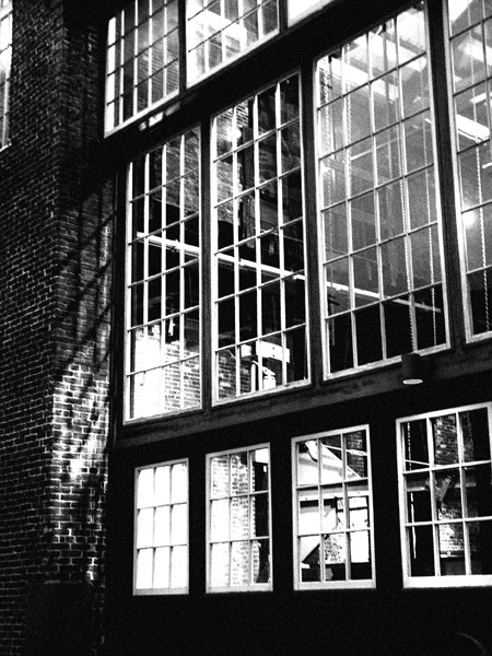
Nice BW image with stark and absolute contrasts. A few things to look at would be the window on the top left corner. This doesn't really add anything to the image so I suggest it cropped out. The bottom of the windows seem a bit dark even on my bright monitor. I suspect that most people would comment on this particular area. I think the layers and textures of this image holds enough merit that you will score great in this challenge. Good job!
Nice urban, grainy feel to this B&W. A little distortion on the left side, but not enough to really detract from the overall composition. I love the shadows on the brick cast by the windows.
I have to say that Garry Winogrand is probably one of my very favorite photographers...and quite honestly, IMO, this image doesn't bring his work to mind. When I think Winogrand, I think mid-century candids, people...images that have an almost vernacular quality about them and often a bit of humor...not high contrast building facades. This is an interesting image but I just don't see any "Winogrand" in it.






 Add photograph to your favorites
 Add photographer to your favorites


 Photographer found comment helpful.


