|
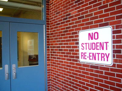
This strikes me as a snapshot of the first sign you came across after reading the challenge theme. There seems to be little consideration given to composition and structure, nor to appeal. If you had focused in on the sign alone, using the contrasting redbrick wall you could have come up with a much more interesting image. |





 Add photograph to your favorites
 Add photographer to your favorites


