I will 'reiterate' what toocool has already stated about the things to LIKE about this image. High key, Soft Focus, Coloration.
I have to agree with the crop and rotation/angle of the image, however, seeing the 4th try, I have to say that this image is the better of the two. Rather than inclusion of more, I fell the image would have been better with less.
A crop closer to the tearduct and a slight straightening of the image would be just fine. I would like to see more negative space on the side opposite of the face.
Overall, an image that I feel was not properly understood by the voters.
Your photographers comments do not give me much to go on as to what you were trying to do with this shot but let's see what we can come up with.
This shot begs for me to tell you what I like and don't like so I'll use that format for this critique...
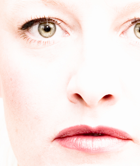
What I like: First of all, I am a HUGE fan of the soft focus, especially in portraiture. If anyone says this is OOF they don't understand soft focus. All the detail is there. Just look at the eyelashes! The wrinkle under your right eye. The creases in your lips. The detail is there. It's just soft. Love that effect! Second, I am also a big fan of high key. It's very hard to pull this off in a portrait and not make it look blown out. You did this perfectly. I would point out the same details in my first point. Thirdly, I am very happy with the fact that you left in what many models (mostly women) would consider imperfections. Thank you for not neatimaging your blemishes or freckles from your cheek. They give you character and make your face what it is. Lastly... You have great catch lights in the eyes! They make a portrait. Without them a model tends to look like a zombie... Ooops, I almost forgot. I love the tonality that this shot has. It's partly due to the high key effect, but it's not all white as some shots of this genre tend toward.
What I don't like: This is a tad bit harder for this shot as there is so much that I like. Your cropping from top to bottom is perfect. You have all the detail that you need to put your personality into the shot. However I'm a little put off by the cropping from left to right. The way you cut your left eye (right in the image) just doesn't look right to me. I don't know why but that's the way I see it. The shot appears to be a little bit crooked. I don't know if this is just the way your face is or if it is a trick of the camera angle. If you rotated the top a tad to the left it would look straighter. If you rotated the top to the right a little it would look artsy. The way you have it looks like an oversight. You have what looks like a hot pixel in your mouth. My eye keeps getting drawn to that spot. I keep wondering if you are chewing on something (just kidding) or if it's just a bad reflection. More detail there would be good but with just one tiny little point of light it looks wrong.
Good vs Bad? You have done an aweseome job with this shot and the good points far outweigh the bad... Work on some of the things I don't like and this would move from a very cool shot to one that is great. Why did this not score better? I would have to say it is a combination of the soft focus (which I love but DPCer's as a whole frown upon) and the cropping left to right. I really wish that soft focus shots would do better here. I beg you to keep posting these kinds of shots if that is what you like to shoot and maybe we can change the voting patterns of the masses.
Kudos on what I think is a great image,
TC
Very nicely done, but I'd prefer to see either less or more of the eye on the right. The half eye looks abruptly cut off rather than interesting, in my opinion. (And, please, this is just my opinion.)
Cropping part way through her pupil gives this image unnecessary visual tension. If your goal was to include all of her lips and only a fraction of the rest of her face, cropping at an angle (e.g. from just above the inside of her eyebrow, across the bridge of her nose, and down her cheek) would have probably been more interesting. A little more breathing room below her lips would have been nice. The catchlight does a good job of highlighting her eye. I think that a less frowny expression would have made this a more pleasing picture.





 Add photograph to your favorites
 Add photographer to your favorites

 Photographer found comment helpful.


