I don't "get it", but regardless, I think it's phenomenally effective, creative, well-composed and eye-catching. Goes to prove sometimes you just don't have to "get it". This also would have done well in the unanswered questions challenge. 9
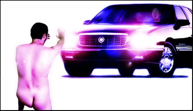
I can't really figure out what you were going for here.. but I don't think the result is aesthetically effective. The purple tint throws off the feel of the shot, the cutout on the body seems a bit rough in spots, and the shot as a whole has a sort of advertisement style, but the style doesn't seem to fit the content at all. There really seems to be some idea that you were going for here, but it's just not all coming together very well for me.
I have no idea what the deeper meaning of this picture is, but it's very effective nonetheless. The stark white background works well, the glare from the headlights is effective, nice lighting on the car. Good post-processing. 8
couldn't see the relevance of the title.. looks too much like two images put together.. might not be but that's how it looks.. lefthand side of the nude looks a little weird.. shape of buttock.. something not quite right
the edtiing needs work - it's a lttle choppy. the idea is creative (which i like) even though I'm not sure i get it (and I like to think I'm one of the ones who usually gets things). The perspective is a bit off as well, but in a shot like this I'm not sure that matters. Creativity outweighs the rest. nice job.
A cool shot, but the guy on the left looks anything but natural. Cool piece of artwork, but I think you've gone way beyond photography - which (despite it being legal for this challenge), puts me off. Cool to see at least one male nude so far, though.






 Add photograph to your favorites
 Add photographer to your favorites


 Photographer found comment helpful.


