| Author | Thread |
|
|
02/14/2006 09:17:59 PM |
Greetings from the Critique Club
I see that everytime you enter a Challenge, your score goes up. Keep this sequence going and you'll be on the front page in nothing flat!
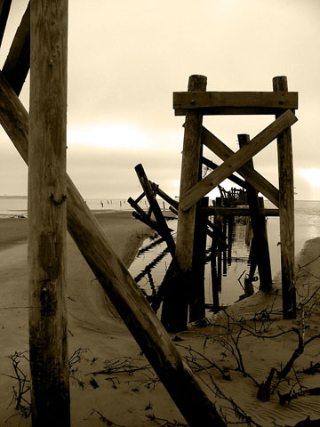
I enjoyed looking at your withered pier (but my brain renamed it weathered pier, almost instantly) The log supports in the sand are elegant and the strong shapes give this image a lot of character. YOur decision to use monochrome definitely enhanced the interest of this composition. I suppose the one thing I would suggest would be to bracket your shots to try to get rid of what appears to be a blown out sky. However, the monochromatic effect definitely reduced the glare from it.
If you have problems resizing your work for DPC standards, PM me and I'll try to help you with it. This would be a scoring plus.
If you think of it next time, it would be helpful if you would include your camera settings and perhaps some indication of what you were looking for in the Photographer's COmments section of the Challenge entry. That would give a member of the Critique Club something to go on if your entry - as you requested - comes up for critique.
Meanwhile, keep up the good work, and I'll look forward to seeing more of your images on DPC.
Alice |
|
Comments Made During the Challenge  |
|
|
02/07/2006 10:48:02 PM |
|
|
|
02/07/2006 06:50:00 AM |
|
nice idea however the main focus is too dark and the first pole is out of focus. If the main subject was lighter or the first pole was in focus would have added to this photo |
|
|
|
02/04/2006 08:15:45 PM |
|
Excellent composition and tone. Lots of nice details. |
|
|
|
02/03/2006 02:44:15 PM |
|
Is a lovely picture, but has lost a huge amount of impact through being small. |
|
|
|
02/02/2006 07:11:40 PM |
|
This is a great picture, I'm giving it a good score for the quality, but I'm just afraid that this will be voted down because of the size, you should use the 640 pixels that we are allowed to use in challenges. |
|
|
|
02/01/2006 02:02:32 PM |
|
I like the composition and the fact you have taken a unique picture, in my opinion though I would like to have seen the sky make more of an impact, more highlights and shadows to make it come alive. It is just a little flat looking for me. |
|
Home -
Challenges -
Community -
League -
Photos -
Cameras -
Lenses -
Learn -
Help -
Terms of Use -
Privacy -
Top ^
DPChallenge, and website content and design, Copyright © 2001-2026 Challenging Technologies, LLC.
All digital photo copyrights belong to the photographers and may not be used without permission.
Current Server Time: 06/29/2026 03:37:35 AM EDT.