::: Critique Club :::
Hi Laurent, this is the in-depth critique you asked us for and it's great that this is your best perfornming image so far on DPC. It's not hard to see why.
First Impression - the most important one:
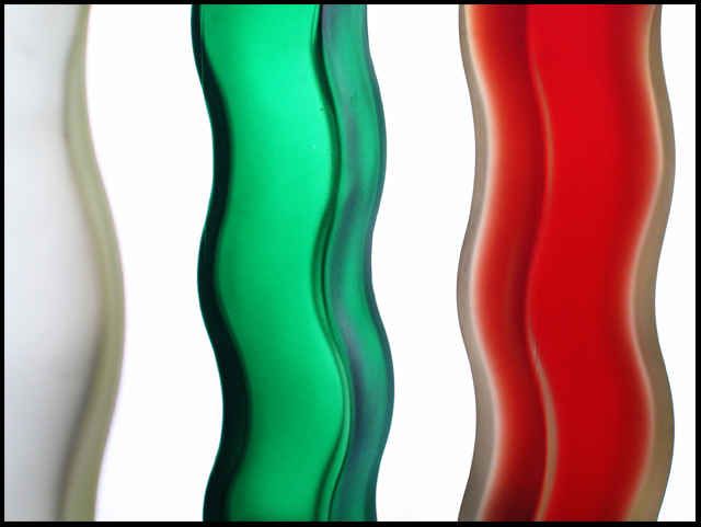
They looked like toothbrush handles to me when voting and they still do. I liked this image from the beginning. The colours looked familiar so I thought it must be a flag I know. It isn't. I wasn't familiar with the flag of Bulgaria until now (although theirs is horizontal stripes).
Composition:
As I said, I felt really comfortable with this as is. It's not the sort of image that has to conform to the "Rules", it makes its own. I'm not sure why the white item is only partially shown. I'd not noticed that before but I suspect it is because the in-betweens are also white that it became just too much white. To see that show maturity in composition, knowing what to leave out shows that.
Subject:
Whatever they are, they work because of their translucence, shape and positioning. They look like toothbrush handles to me, it doesn't really matter what they are but if you request a critique it's helpful to have some details in your "Photographer's Comments" about the setup, the dificulties, the agonies and the triumphs.
Technical (Colour, focus, and light):
For an out of focus image, this has scored incredibly high on DPC. OOF is usually an unforgivable sin which results in sub-4 scores. Apart from that, I really am impressed with the backlighting and the true, clean colours.
To grow its vote?:
I wonder what a sharp focussed version would have scored. It clearly touched peoples imaginations as is and batted way above average.
Summary:
Such a simple and powerful idea. I'm impressed with you thinking of the concept and nearly brining it off. As your best scorer so far, you can be justifiably proud.
Brett |