| Author | Thread |
Comments Made During the Challenge  |
|
|
01/28/2006 11:38:59 PM |
|
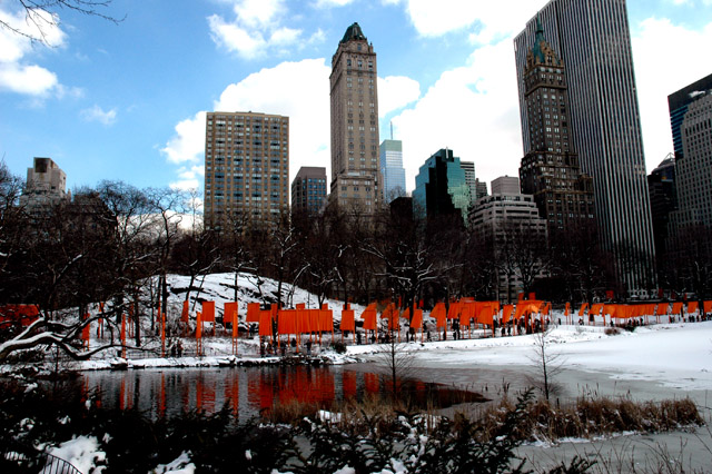
You should have gotten closer to the subject, the "Gates". As it is, you can't tell if the gates are the subject to the buildings. |
|
|
|
01/28/2006 09:52:27 PM |
|
good view of display. pic looks too high contrast though |
|
|
|
01/26/2006 08:09:49 AM |
|
|
|
01/22/2006 06:04:57 PM |
|
sky is over-exposed. Horizon is tilted. Buildings look as if they are leaing backwards. I think if you corrected the angles this would be a much better image |
|
|
|
01/21/2006 12:57:39 PM |
|
Would have benefited from straightening the horizon |
|
|
|
01/20/2006 07:15:13 PM |
|
I was going to use something simular , so a 7 for you |
|
|
|
01/20/2006 05:22:24 PM |
|
Not enough emphasis on the subject in your title, and the shot just comes across as being extremely busy. |
|
|
|
01/20/2006 03:27:00 PM |
|
Not a bad shot really but I count 4 details that would just make this shot soo much better IMHO. 1. The image is tilted to the left wich I dislike. 2. The clouds are totally blown out. 3. The top of the tallest building seems unnessecarily cut off, if I had taken this shot I would rather have skipped some of the foreground and included the whole building. 4. Those branches in the upper left corner should have been edited out, they add nothing to the shot IMHO. |
|
|
|
01/20/2006 01:23:10 PM |
|
Nice capture. The colors are great. Your skyline looks a little tilted though. |
|
|
|
01/20/2006 08:46:03 AM |
|
I think the contrast is a bit high here, since you've lost some shadow detail, and the clouds are overexposed. I also think you should maybe have done some distortion adjustments in photoshop to get all the buildings straight. |
|
|
|
01/19/2006 07:49:05 PM |
|
Oh the gates! How wonderful! It appears that NYC is tilted however. |
|
|
|
01/18/2006 10:10:13 PM |
|
|
|
01/17/2006 10:34:31 AM |
|
Nice but the lake and the lacey trees on the left tend to throw it off balance. maybe you could have moved more to the right and cropped out that element. Also capturing the movement of the "gates" in the wind would have been a great addition. Movement against the stability of the skyscrapers would have made for a nice contrast. |
|
|
|
01/16/2006 04:04:22 PM |
|
Too bad for the tilted horizon and the overexposure... |
|
Home -
Challenges -
Community -
League -
Photos -
Cameras -
Lenses -
Learn -
Help -
Terms of Use -
Privacy -
Top ^
DPChallenge, and website content and design, Copyright © 2001-2026 Challenging Technologies, LLC.
All digital photo copyrights belong to the photographers and may not be used without permission.
Current Server Time: 06/28/2026 09:49:46 PM EDT.