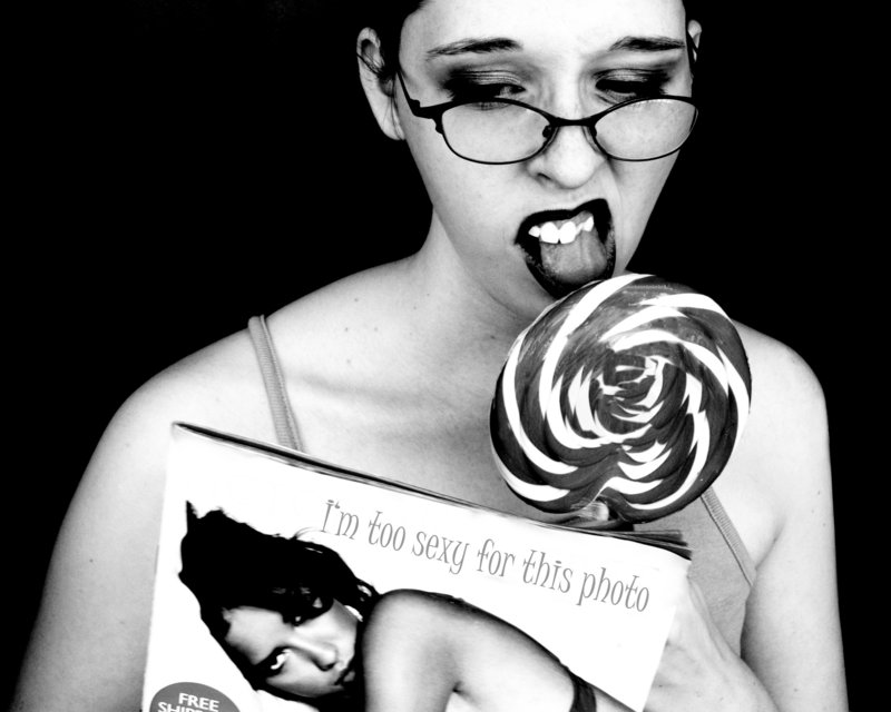
HA! Gotta love the 'editoral' opinion slapped on the edited version of the magazine. Excellent job in darkening the background for it allows the model with her lolly and magazine to pop off the page. B&W conversion has a wonderful dynamic range to the light and dark tones. Good job there. Also great job in removing the 'words' stuck to the lolly. In this final version the spiral of the lolly is detailed and unbroken with that words that were originally plastered onto it. Love the pose/attitude of the model as she is sucking the lollipop and flipping through this magazine. My only plaint (and a minor one at that) is that the head of the model on the magazine cover appears to be a sharp diagonal line. In the original you see that her head is resting on a pillow - here her head looks like it is resting a flat space. Perhaps burning back in some of the lines that defined the pillow back in will not make her look like such a 'flat line' head.




 Add photograph to your favorites
 Add photographer to your favorites

 Photographer found comment helpful.


